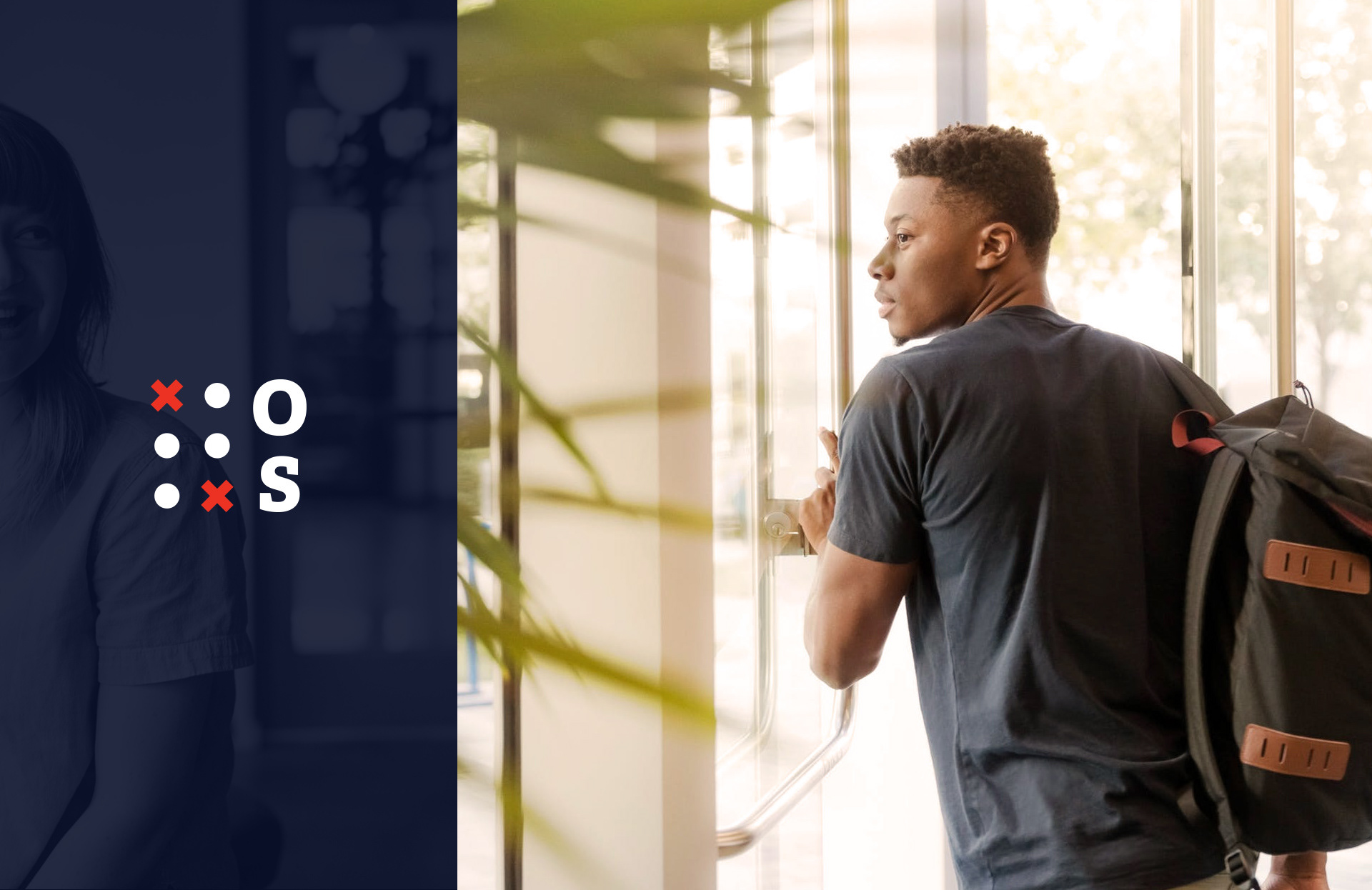
UX/UI Design and Brand Redesign for Options Solutions
Full-service educational consultants.
Located in Vancouver, Canada, Options Solutions is a full-service educational consulting company that empowers students to pursue their academic goals. Their main areas of expertise include advising for post-secondary institutions in Canada, the USA, and the UK, exploration of interests for adolescents, application writing consultancy and educational support for groups.
Year
2019
2019
My Role
Research | Stakeholder Interviews | Branding | UX Design | UI Design | UX Writing
Research | Stakeholder Interviews | Branding | UX Design | UI Design | UX Writing
Responsibilities
User experience design, brand redesign, research, information architecture, communication, presentations, iterations, visual design, brand book creation.
User experience design, brand redesign, research, information architecture, communication, presentations, iterations, visual design, brand book creation.
Problem and context
Options are one of Vancouver’s pioneers in student consultancy, carrying a long history and accreditation. However, they weren't portrayed as an innovative and student-centric company. Instead, the branding looked amateur and outdated. The website was slow, it had plenty of usability flaws and missed opportunities for conversion. They also had plans to expand to other cities in Canada.
Goals:
• Redesign Options Solutions brand to be seen as mature, unique, and to feature secondary applications for their events
• Create a brand guide.
• Redesign Options' website to feature the new brand, responsive design and new ways of conversion.
• Improve website conversions by at least 1%.
How might we showcase a more contemporary and exciting side of Options Solutions by redesigning its brand and website while preparing it for national expansion?
The Approach
1.
Discovery research: understanding the current state of the brand
The project was divided into three major phases: research, branding and website redesign. We did the brand and user research at the same time, but we approved the new brand visuals before moving into the website redesign
Picking an educational consultant is stressful and families need to be confident in their choice.
We set up a survey to understand the reasons people require Options Solutions’ services and what are their difficulties (pain points). We also had meetings with stakeholders to understand their vision for the project and business.
Some questions we asked:
• How old are you?
• Are you a parent or a student?
• Why are you interested in Options’ Solution Services?
• What makes you excited about Options Solutions’ services?
• How can we improve the website and our services?
• What are the biggest challenges when applying for a university or deciding on a career?
• What’s important for you when selecting an educational consultant?
• Any other suggestion, issue, an idea you want to share with us?
The audience knows that decisions made from grades 9–12 set the stage for their careers and life. The decision-makers are the parents and most learn about Options through word of mouth. It is also clear that getting into a university isn’t the only concern.
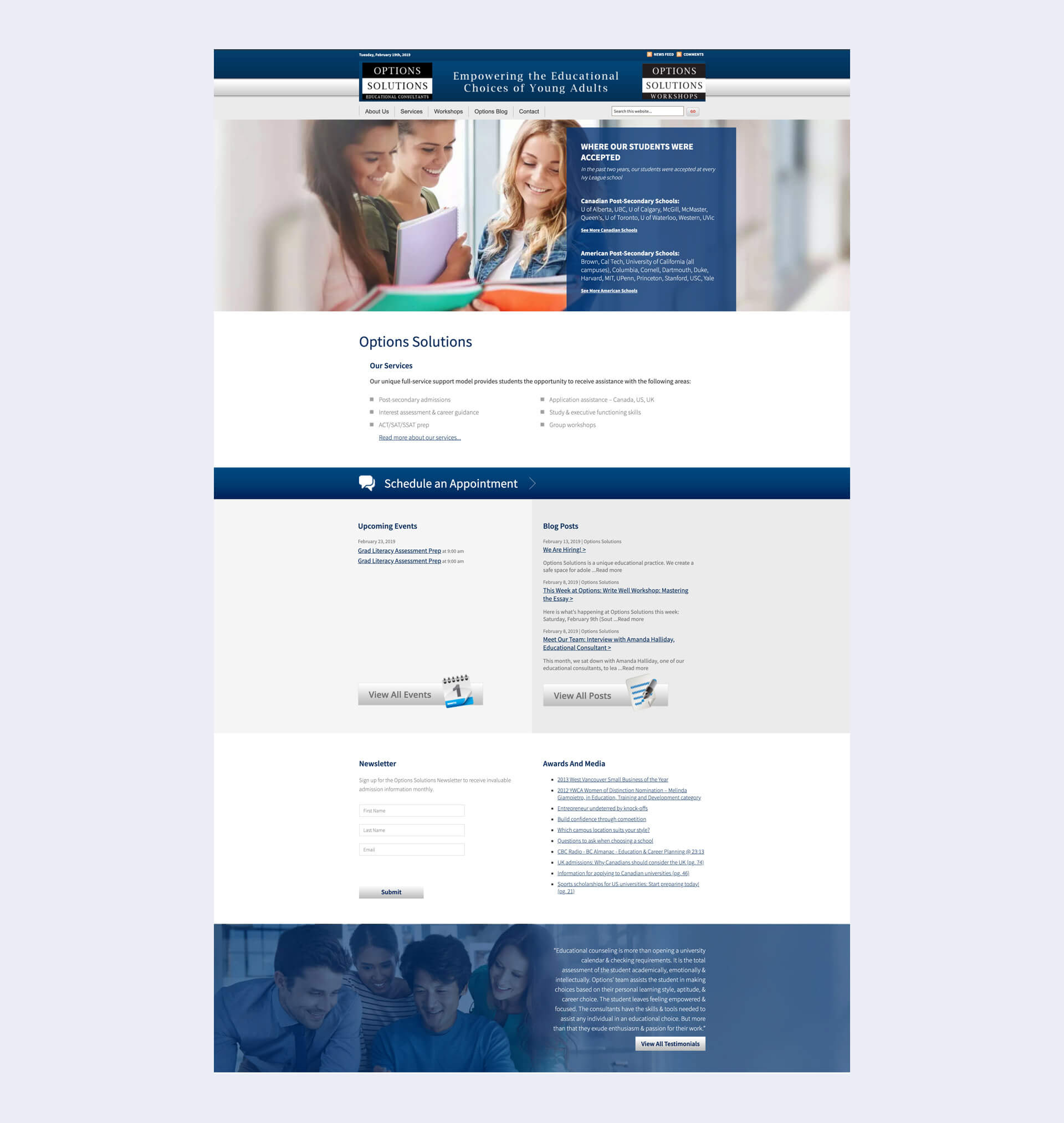
Options Solutions' past website.
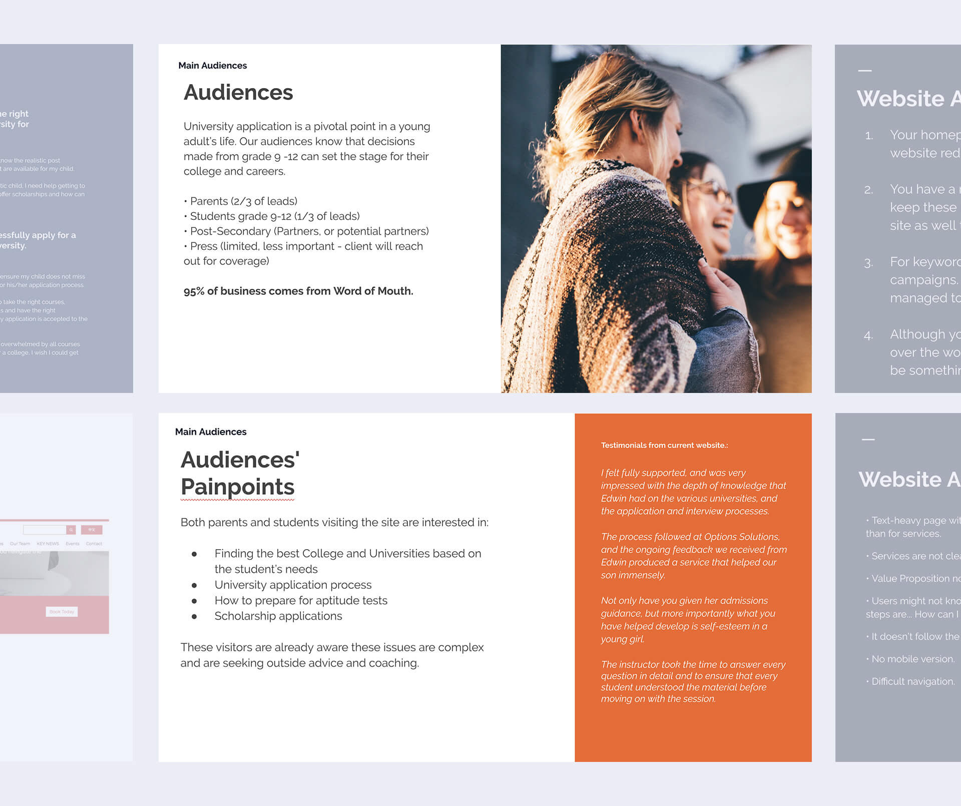
Excerpt of audience and research presentation.
By being such a stressful phase, parents tend to seek help to feel supported and confident about their children’s future. Most of the worries go away once they have a clear roadmap of actions and decisions made by a qualified professional.
By analyzing Google MyBusiness, Yelp and Social Media reviews, we also found out that parents like to know more about who the consultants are before selecting a company, meaning that a section showcasing the Options Solutions team (with bios) was essential.
Options already had a brand guide however, it wasn’t being used to its full potential.
Options are one of Vancouver’s pioneers in student consultancy, carrying a long history and accreditation. However, they weren't portrayed as an innovative, professional and student-centric place. Instead, the branding looked amateur and outdated.
After meeting with stakeholders, we had a few visual brand constraints to follow: blue and red should be the primary colours, the symbol couldn’t be anything related to school or university (e.g. Crest, a grad cap, pencil…) and we must have a version with only the OS letters.
On the other hand, the available brand guide already listed the company vision, positioning, tagline and brand values, which we would not change.
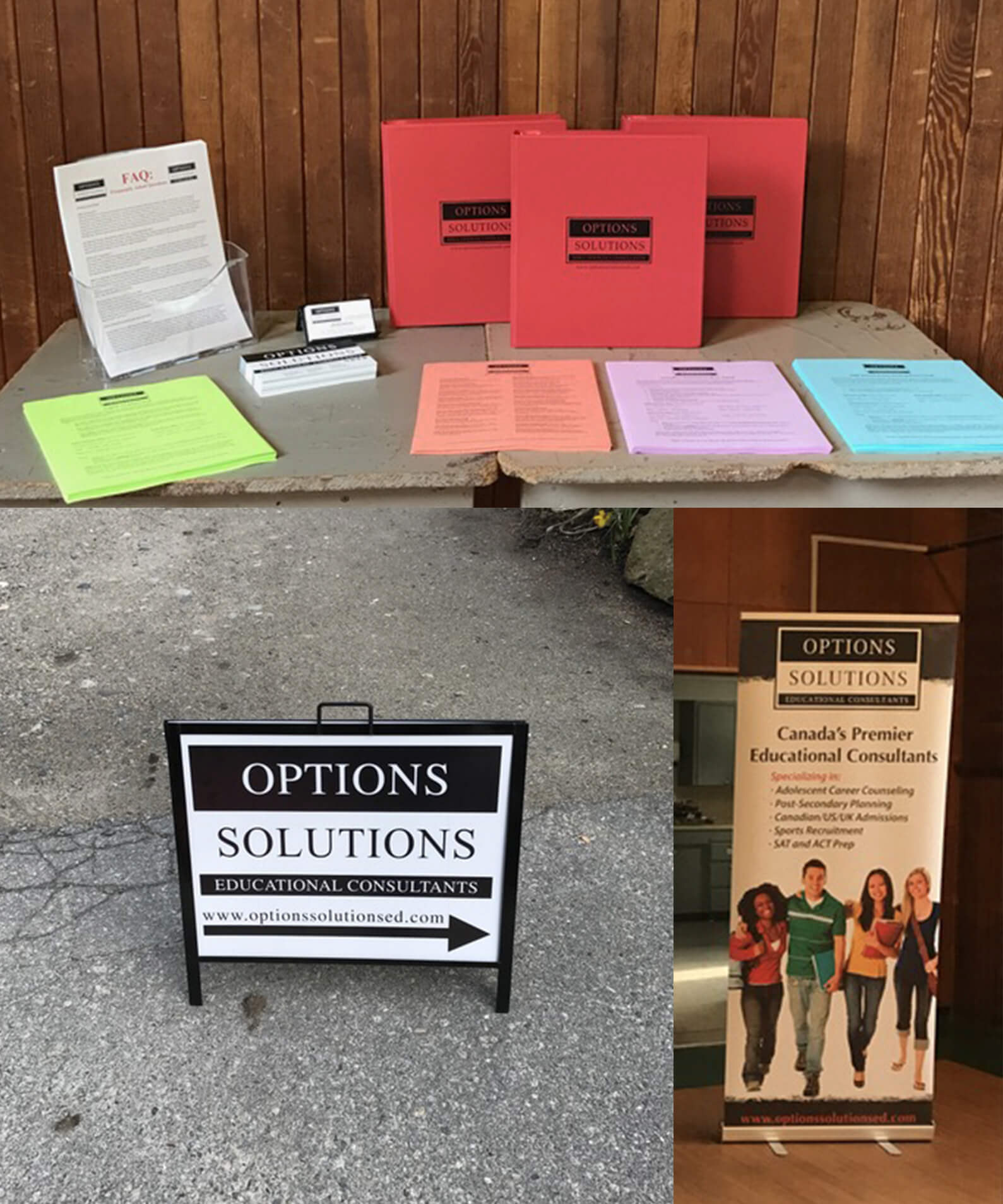
Former brand applications.
2.
Branding: how Options should be perceived?
Mood boards illustrate possible visual paths
Options need to be perceived as a trustworthy organization, someone that has your back and knows how to navigate the complex educational system.
Using the established brand values as a guide, we put mood boards together to show how keywords such as “professional” or “friendly” could look like. The boards were discussed with the client and a fourth board was put together, combining two visual directions.
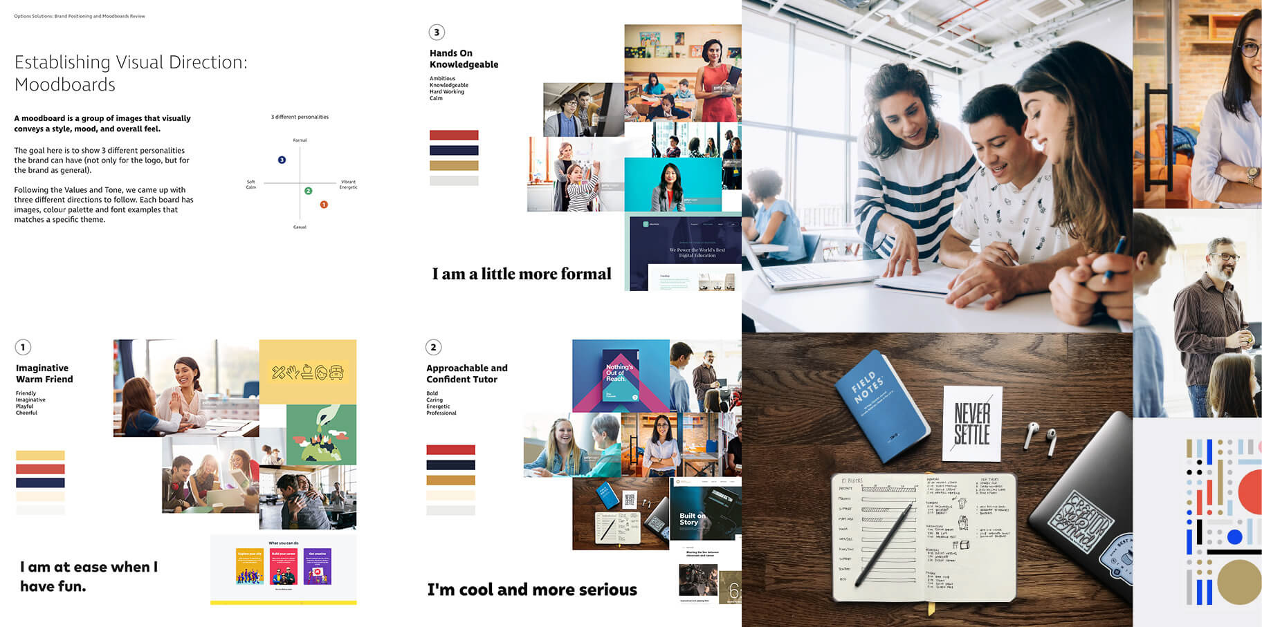
Mood boards were put together to help us visualize what's the personality of the brand.
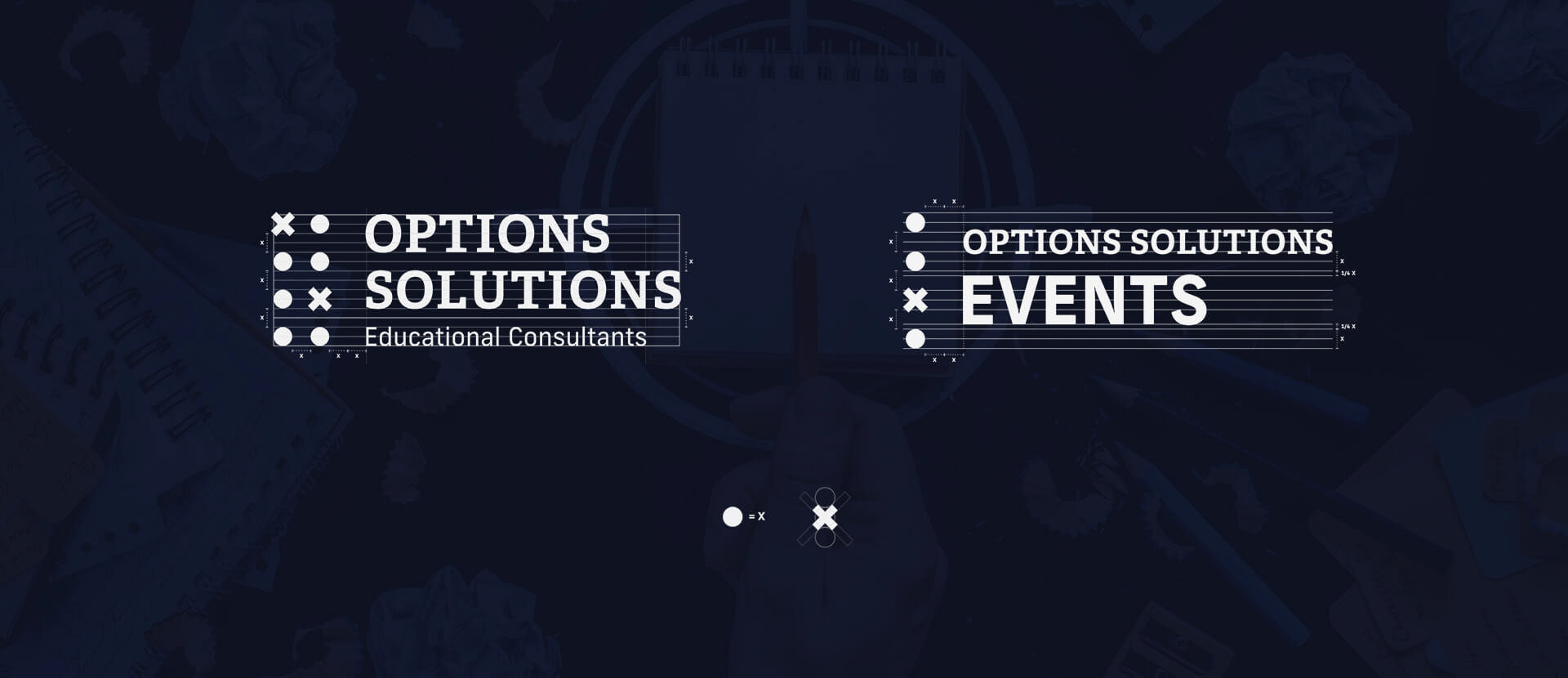
Final logo concept: Solutions for options
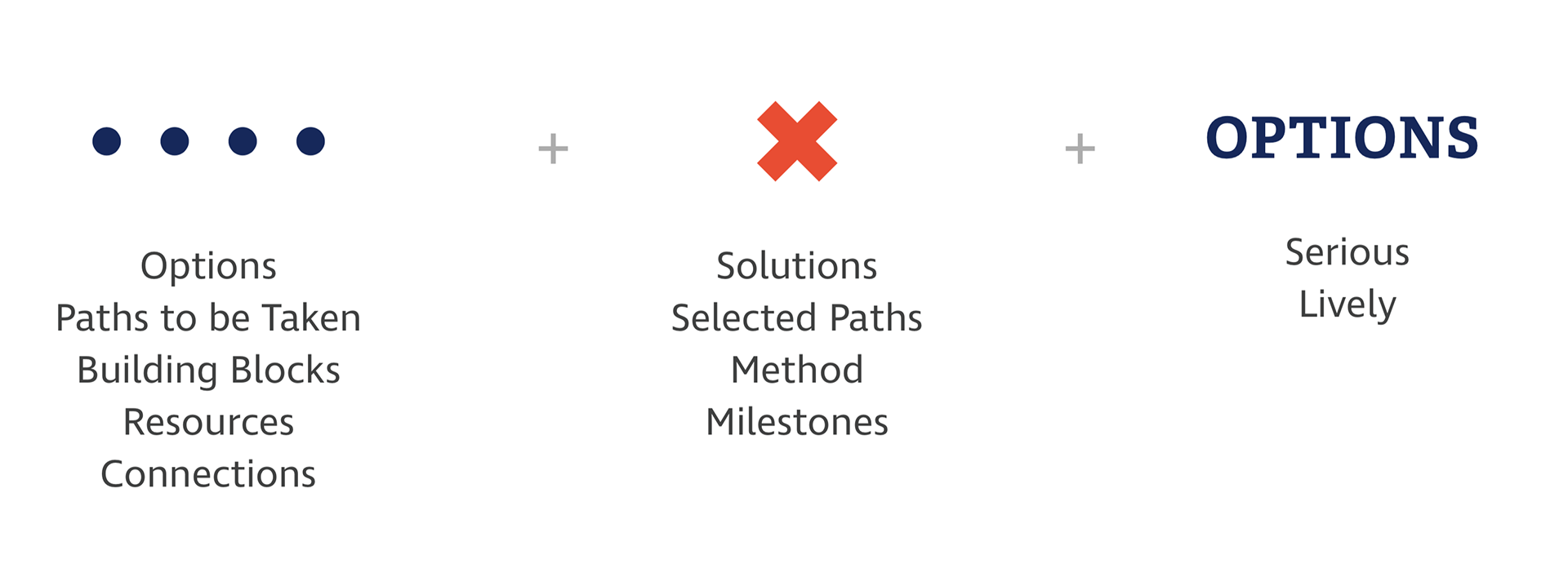
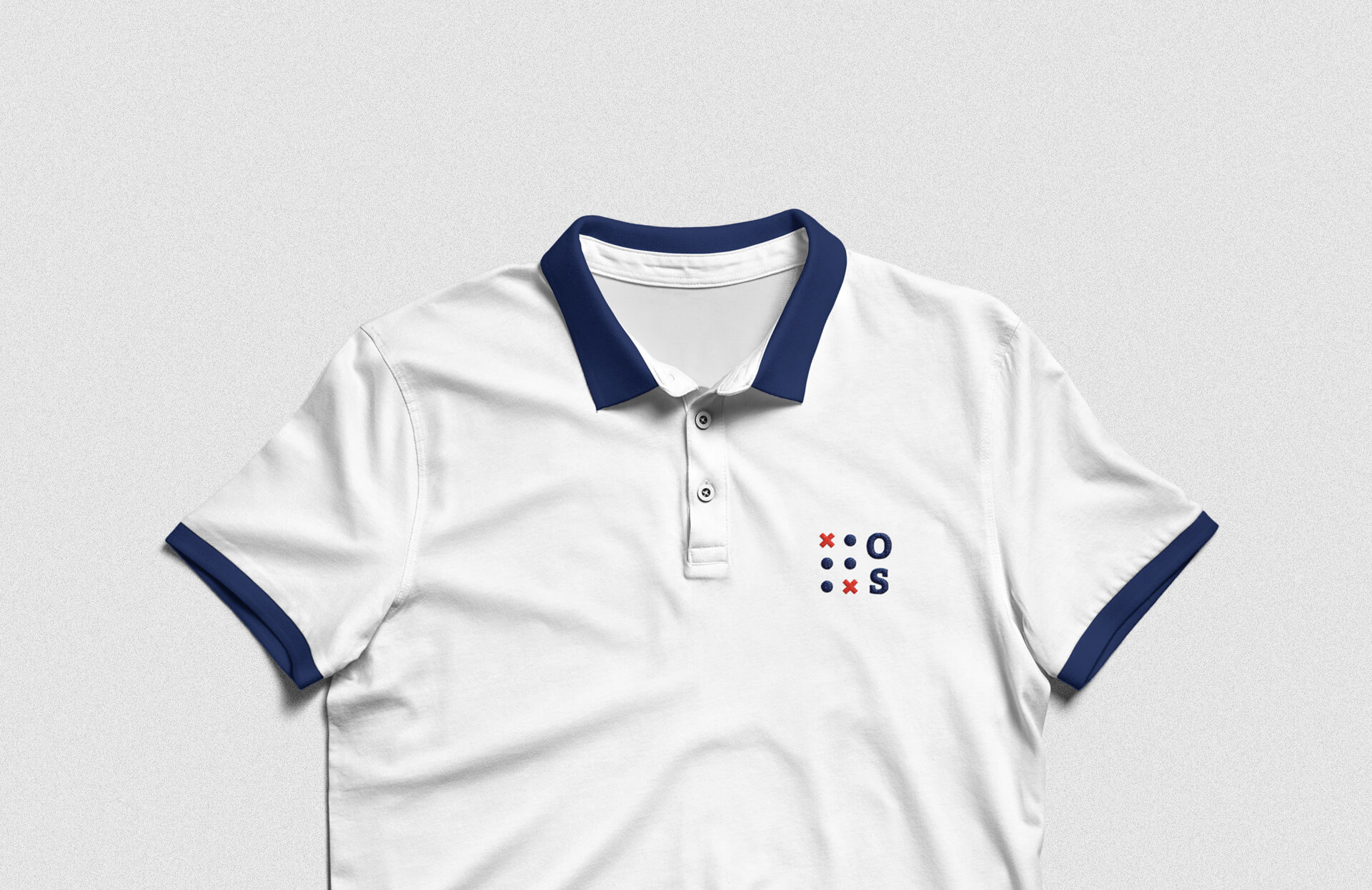
The final concept was called “Solutions for Options” and represented the materialization of the company name. Options Solutions assists students when they are overwhelmed with too many possible career paths to pursue. The circles represent the different paths before graduating (the options), while the X represents the paths selected with confidence (the solutions).
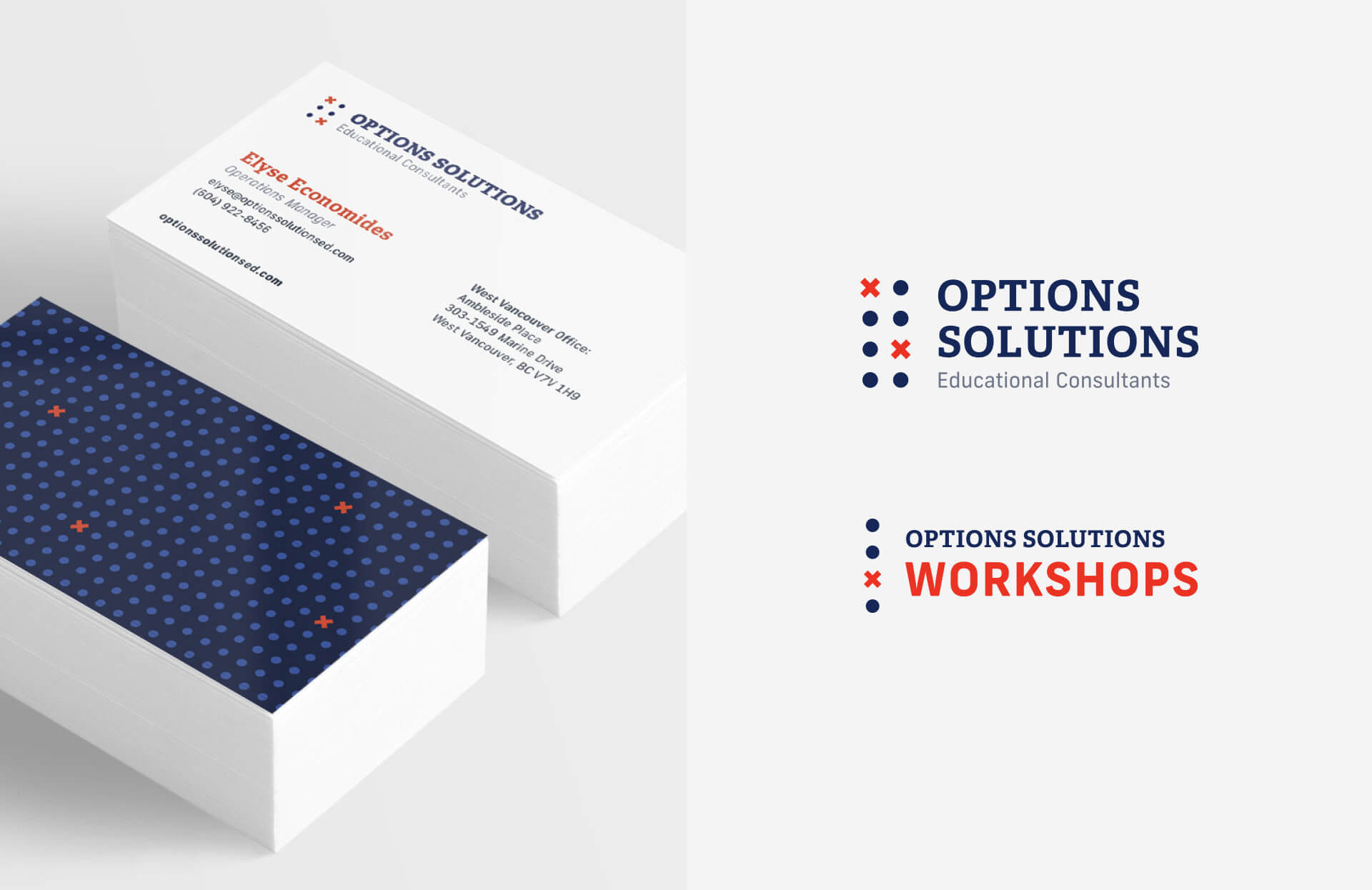
Breakdown of the elements of the logo
The final main typeface, Adelle, shows personality while still being serious. The secondary type, selected for body text, is called New Frank. It has a dynamic, energetic and contemporary feeling due to its squared, industrial drawing.
We also created logo variations to be used for workshops, small sizes, avatars, favicon...
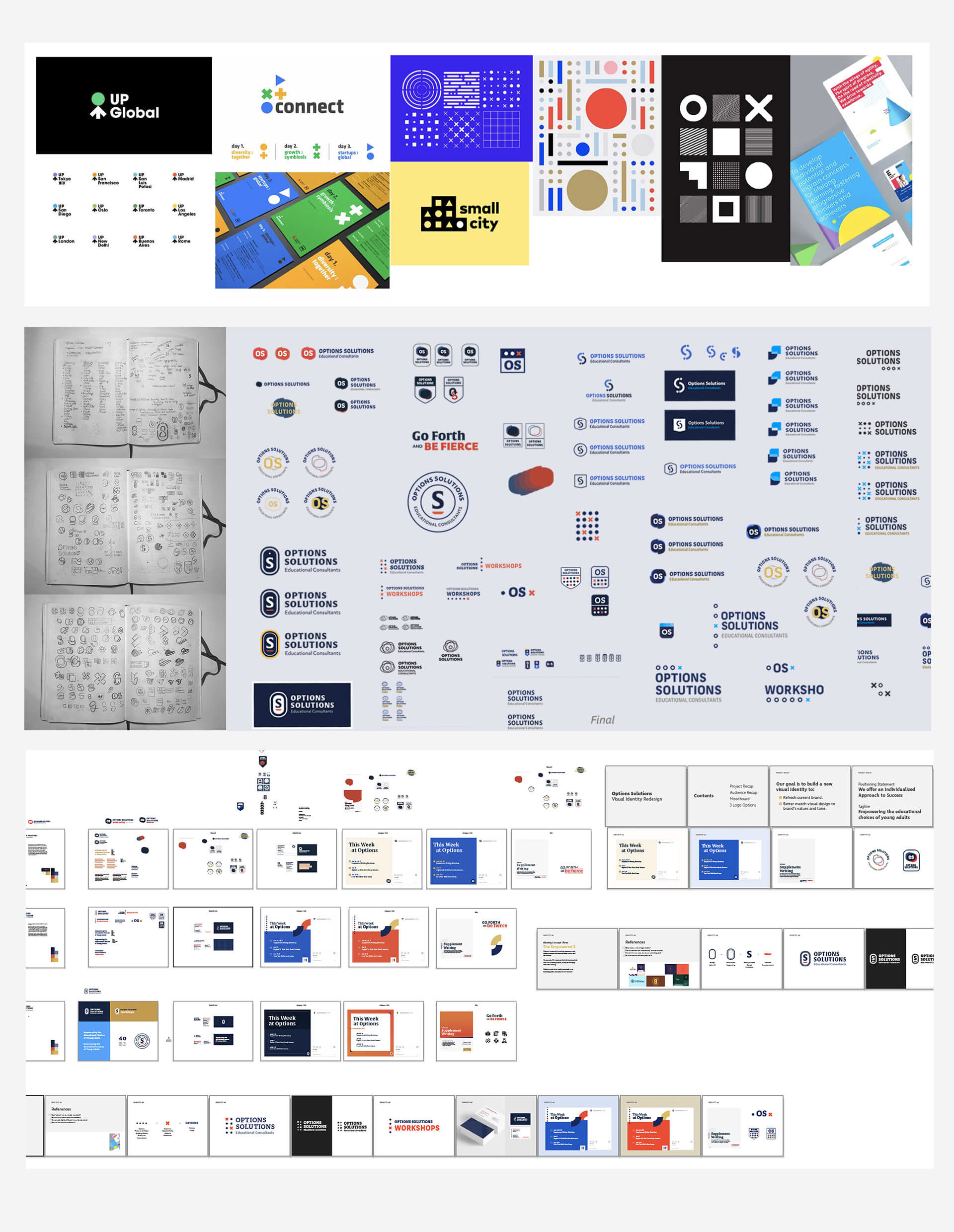
From top to bottom: Brand references, logo sketches and visual brand exploration.
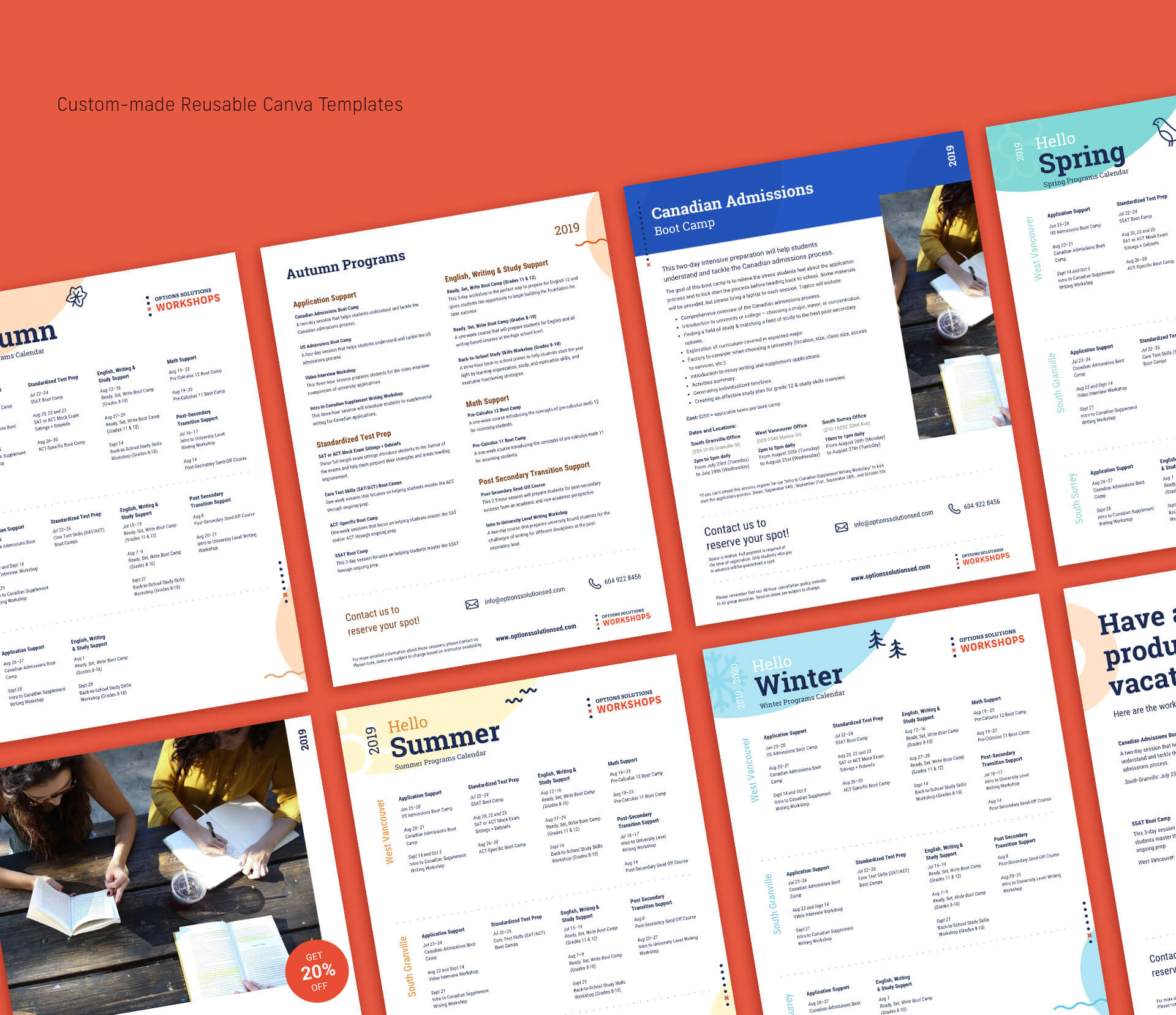
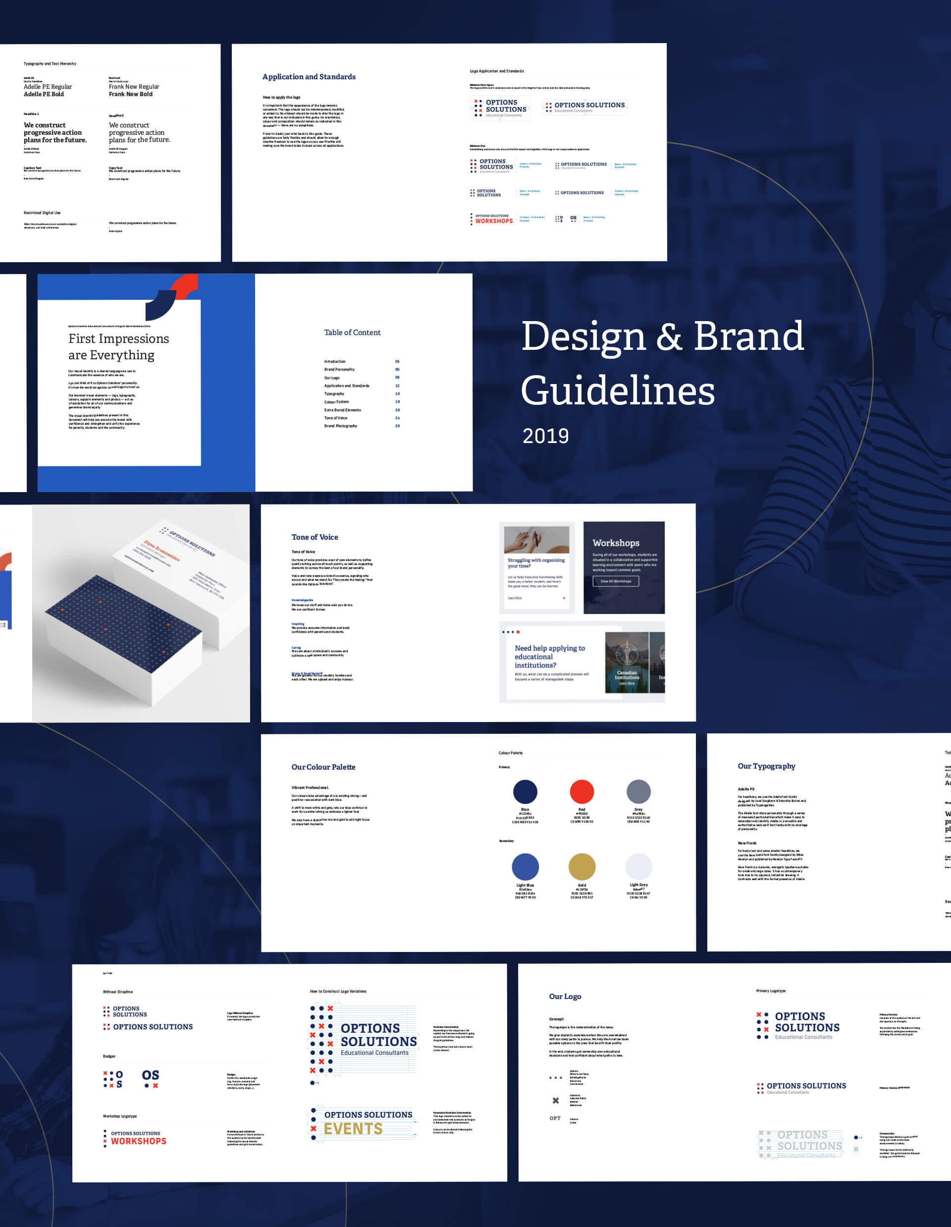
A new brand guide plays an important part in Options' national expansion. Colours, images, tone of voice, and logo options help keep the brand consistent while having space for customization across different media.
3.
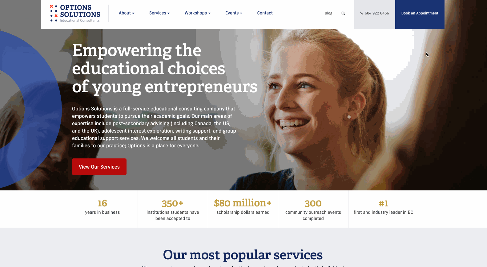
Website Redesign
Convoluted navigation, slow performance, and wrong clicks were contributing factors to the high bounce rate and loss of potential students.
To gather insights into how the website was performing, we collected data through Hotjar for one month. We confirmed most of our assumptions.
Heatmaps showed us that users were clicking on the wrong links due to faulty UI. The main navigation had unnecessary friction (users had to go through a three-step dropdown to find any service) and the hierarchy of the Home Page didn’t match users' mental models.
The website had 43% of visitors coming from mobile and leaving shortly after, probably because there wasn’t a mobile version at all. The website’s loading time was slow and it had less than 1000 visitors per month.
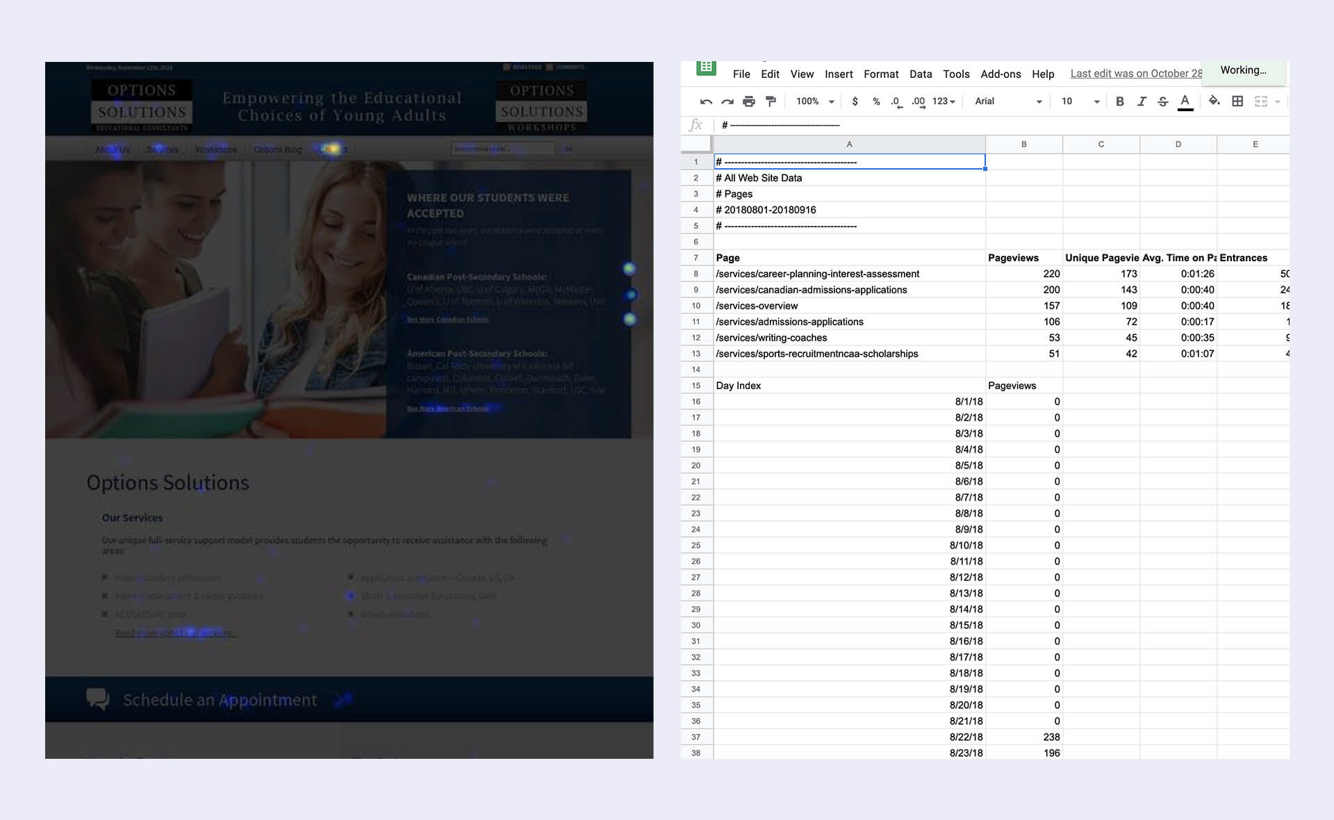
We collected heatmaps and analyzed Google Analytics.
We created user stories to be used as a guide for navigation, new features and overall strategy.
We separated the main audience into two groups: people that were looking for career coaching and people that only wanted to apply to a university. The stories were presented and discussed with the client, which later used them to create targeted content for each group.
Users' main desires are to find career coaching and university application services.
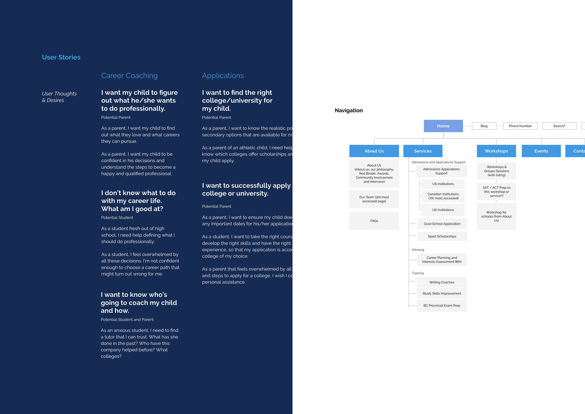
User stories and new navigation.
New website sections to guide parents on how Options Solutions can ease their anxiety over choosing and applying for a university.
As a parent, you want your child to be confident in their decisions and understand the steps to become a happy and qualified professional. You also need to trust the consultants and understand Options Solutions’ positioning within the market.
Analytics showed us that people were accessing the Canadian, US and UK institutions more than any other service, so it was natural that those should go on top.
To help parents contact, we added a phone on top, book an appointment button that links to a form and, finally, an in-page contact section for service pages. Unfortunately, we couldn’t add an online booking system due to project limitations.
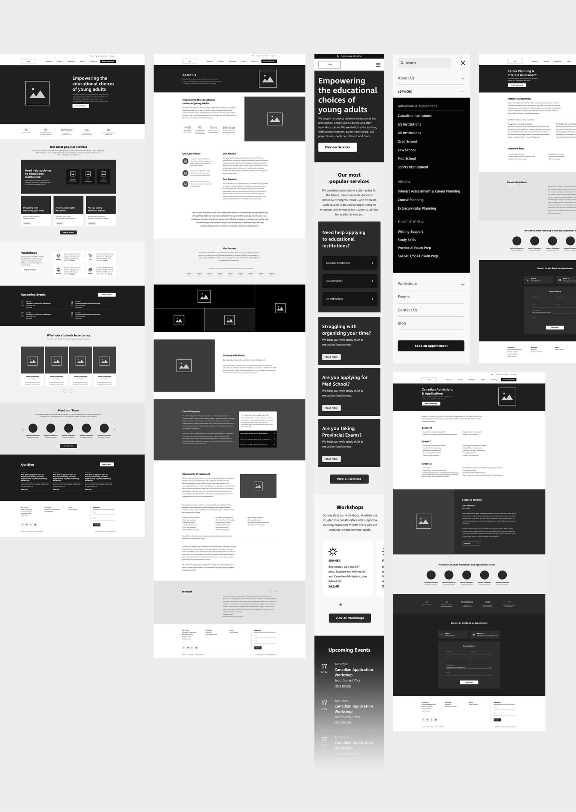
We started designing wireframes for mobile and then expanded it to desktop.
Vibrant, motivated and professional: the effective usage of Brand Guidelines.
We kept the visuals and interactions simple while having some exciting hover elements to spark curiosity and talk to the younger, student audience.

4.
Results: Positive results but still more to improve over time.
I love working with clients that are passionate about what they do. A strong foundation for digital strategy comes from clearly defined business and user goals. Even though it’s still too soon to report finalized analytics data, we had good results in the first 6 months.
At the end of the first 6 months (from May 2nd to Nov 2nd):
Bounce Rate: 49.5% (vs 61% previously).
Average Session Duration: 00:02:18 (26.5% increase).
Pages per Session: 2.76 (12% increase).
58% of sessions are using a mobile device.
46.0% of sessions use a desktop.
Average Session Duration: 00:02:18 (26.5% increase).
Pages per Session: 2.76 (12% increase).
58% of sessions are using a mobile device.
46.0% of sessions use a desktop.
Conversion rate: 8% in 3 months.
Between Aug 27 — Nov 24, 2019, we had 5,469 people visiting the website. 8% of these people contacted Options Solutions in some way. The majority of conversions came from the new “Book an appointment” form on the header.
In-header Book an Appointment form is leading the conversion stats.
We had great results from the new features we added, but we still need to improve some areas:
• We couldn’t redesign the calendar journey and we had to rely on a plug-in. Options have a lot of events and workshops that could benefit from a better calendar experience.
• The ability to schedule classes online and find the best consultant based on users' needs would be an outstanding feature.
• Due to budget, the project didn’t have a content specialist to write and edit the website and social media content. We created a small content guide to assist, but that was all we could do
We met our goals at the end of the six months. The client was ecstatic about the redesign, as they received some great feedback from the audience and all elements were working as they should. However, due to the project’s limitations, we couldn’t go further in our approach and deliver an even better experience.
____________________
Credits:
Brand Design, UX/UI Design: Marcos Duda.
Web Development: Alonso Ysa.
Project Management: Rory Mullin.
Account Director: Evan Holmgren.
Developed at CodeHammerhead.
Web Development: Alonso Ysa.
Project Management: Rory Mullin.
Account Director: Evan Holmgren.
Developed at CodeHammerhead.