Epiphan website redesign and design system.
Creating a system to speed up website updates
Epiphan is a company that manufactures video encoder devices and digital tools to facilitate video production and streaming. Epiphan's website needed restructuring and a faster way to be updated by the marketing team. 
Date
Sep 2020 — Mar 2021
My Role
Branding | UX Design | UI Design
Responsibilities
Conducting meetings, research, design system creation and documentation, visual design, project management, and iterations.
Problem and context
Epiphan's website wasn't easy to update and the marketing team needed help from designers and developers every time they needed to create and publish new pages. On top of that, the website didn't feature a cohesive visual design.
Goals:
• Develop a basic design system utilizing the available assets. Ensure the company understands its value and has documents outlining its usage on the web, print, and video media.
• Make the website easy to update so our content team can create and edit new pages using the visual WordPress Gutenberg editor.
• Improve website performance, e-commerce purchase process and overall website security. Achieve a "green" score on Google's page speed insights and add tools for website security monitoring.
• Quick turnaround (between 5-6 months) for the first version, meaning we had to work only on the most critical areas.
Discovery: getting everyone involved.
A discovery process was done by checking Google Analytics, looking into our documentation, reviewing a Customer Experience Survey, checking our available personas, doing interviews with the experts from the company, and gathering requirements from the people that would work with the system later.

Previous website design.

The research revealed:
• What were the different types of content we had, how the team created content, and what website integrations were being used.
• Inconsistencies between UI elements like buttons, colours, hovers, and banners.
• Lack of a unified brand message or an understanding of our brand identity by the team.
• Problematic areas of the website that needed to be restructured.
• Blog was the main source of traffic: 61.58% of total users accessed some kind of resource page from us, the blog being the most important section.
• People don't know the names of our products: They need to see product images attached to product names whenever possible.
• Users need to see our products in context. The Audio Video (AV) industry is very technical, so users benefit from seeing where our products would fit in their workflow — saves them time and mental load.

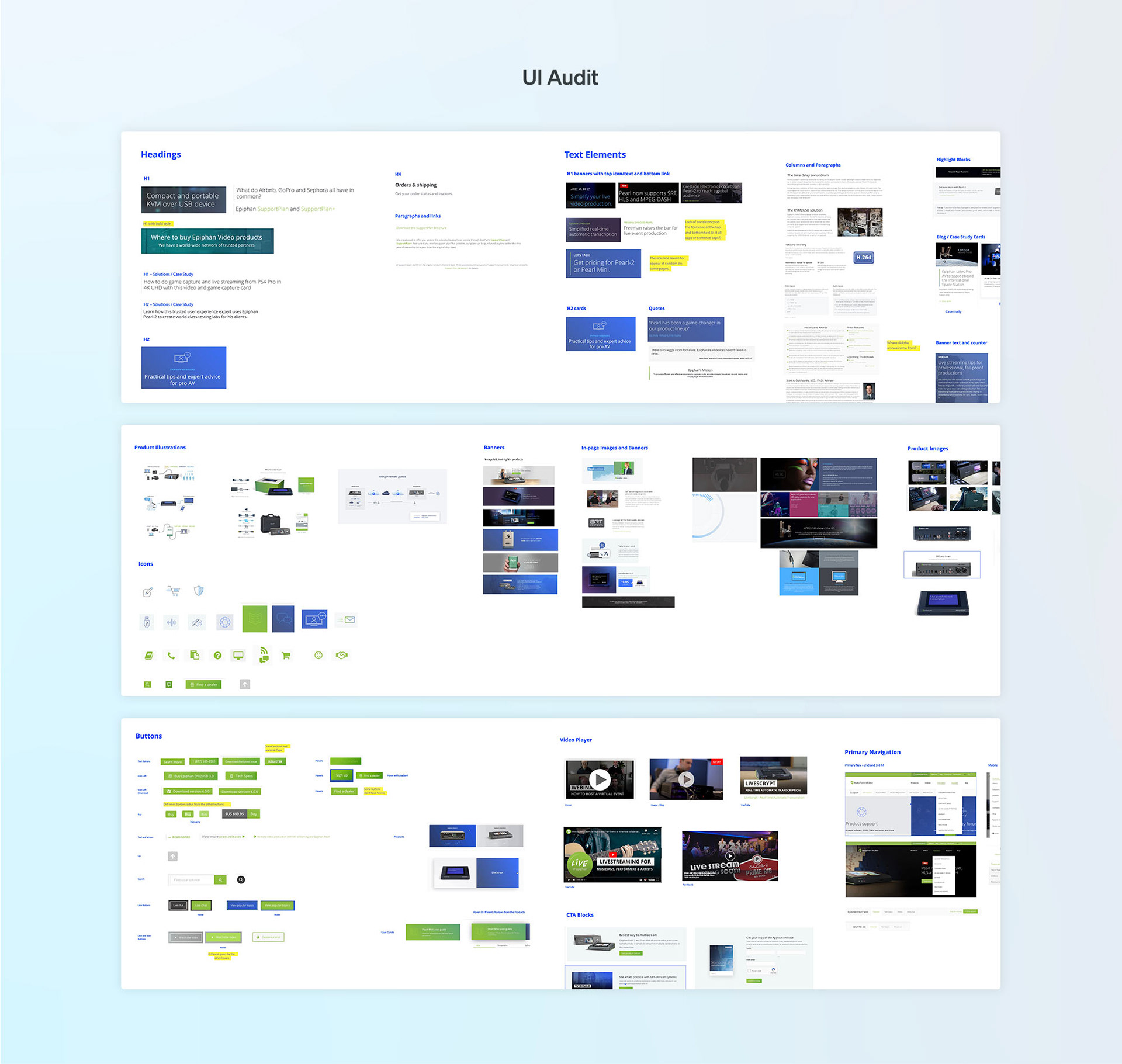
An audit of the user interface was made so could have a clear idea of all necessary elements.

Epiphan is approachable, nimble and enthusiastic
I worked with the marketing manager to define how we wanted to be perceived as a brand. Epiphan has been around for many years with defined brand equity, however, we didn't have a document outlining it.
Later, we had a rebranding exercise as a different project, based on the information uncovered at this preliminary stage.

....

The home page got a redesign with new content and strategy while some other pages only got a visual lift.
Prioritization: Since we were pressed for time and redesigning whole content sections of the website would require bringing more people in and slowing down the process (plus taking SEO hits), we decided to focus only on the absolutely necessary.
That being said, we did push for either a complete redesign or some edits in some critical areas such as the home page, product pages, and overall website navigation.

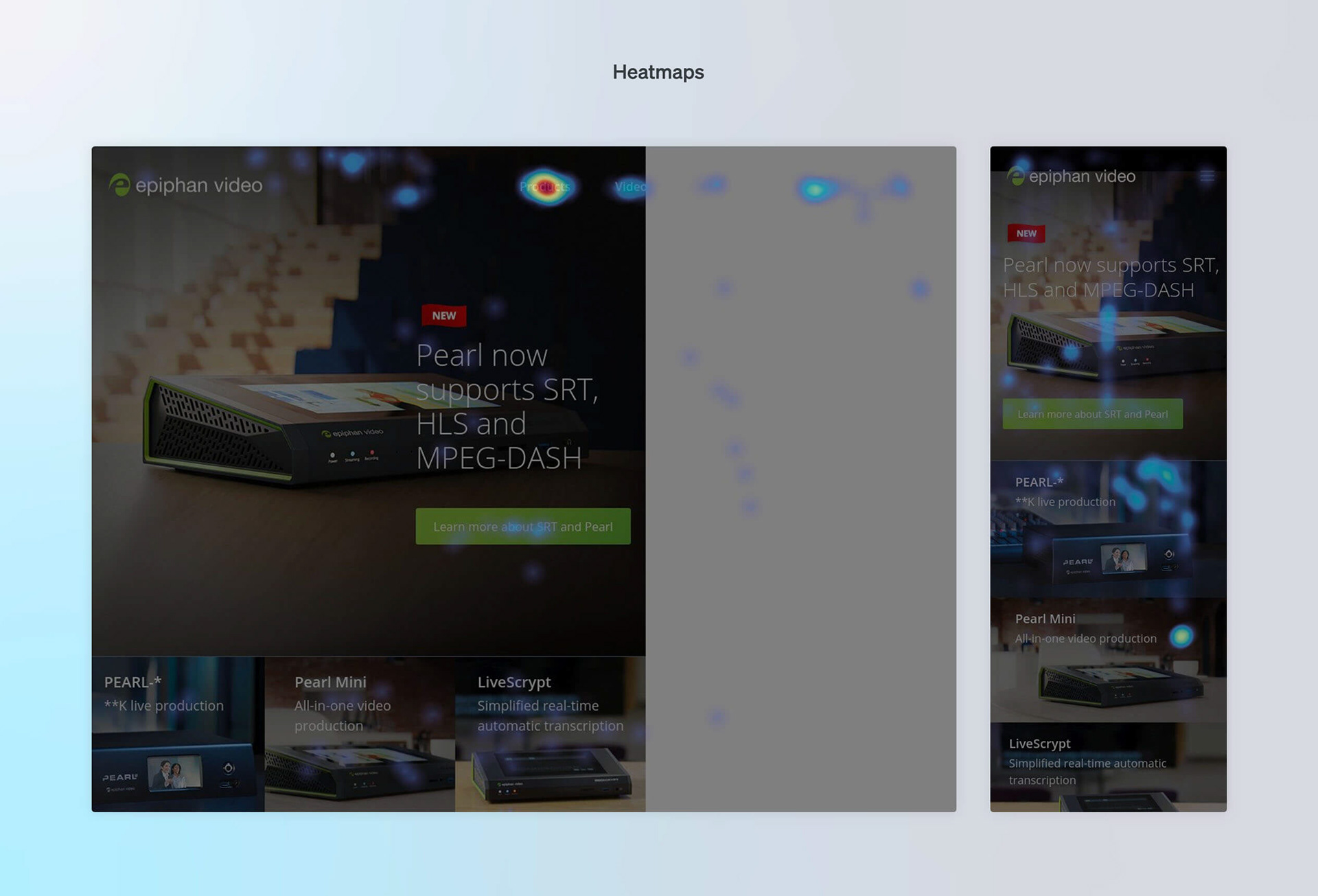
Heatmaps helped us identify what sections were more important. We could also see that the carousel wasn't being utilized by visitors.

New UI elements, colours, and accessibility
A big factor in our brand colours was accessibility. Our current buttons were light green with white text and had to be changed to a blue background if we wanted to keep legibility at W3C AA.
Once we defined the brand's visual foundational elements, we designed the system. To keep us in check, we kept referencing back to resources like the atomic design by Brad frost, Invision’s Design Systems Handbook.

We built the new structure with a 12-column grid.

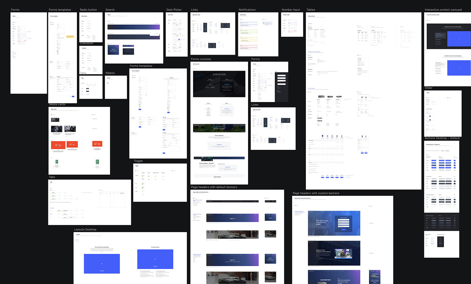
A UI kit was created, considerably speeding up the design of custom pages.

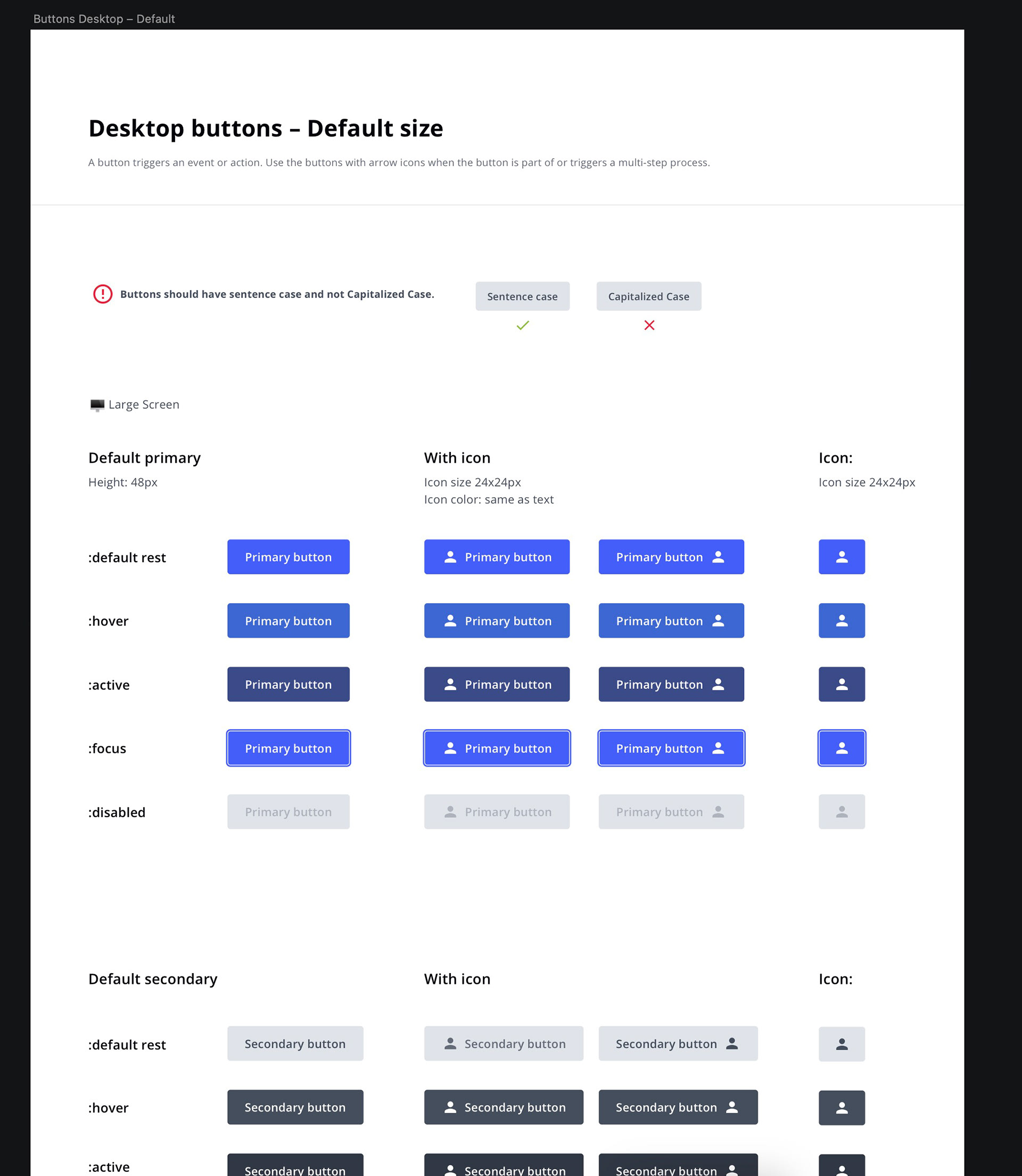
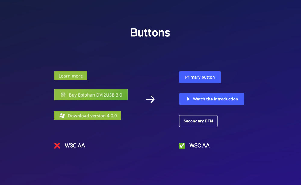
An example of some rules and styles for buttons.

We were testing elements against each other by building pages and showing them to the content team. 
In tandem with the new basic UI elements, I was also creating examples of organisms and full pages. This way I could test the elements against each other and ask for the team's feedback. The team reviewed the pages and we made sure that everyone was aware of the process.
We couldn't do much work in some areas of the website due to either a lack of resources to rewrite the content or because we couldn't suffer SEO hits.

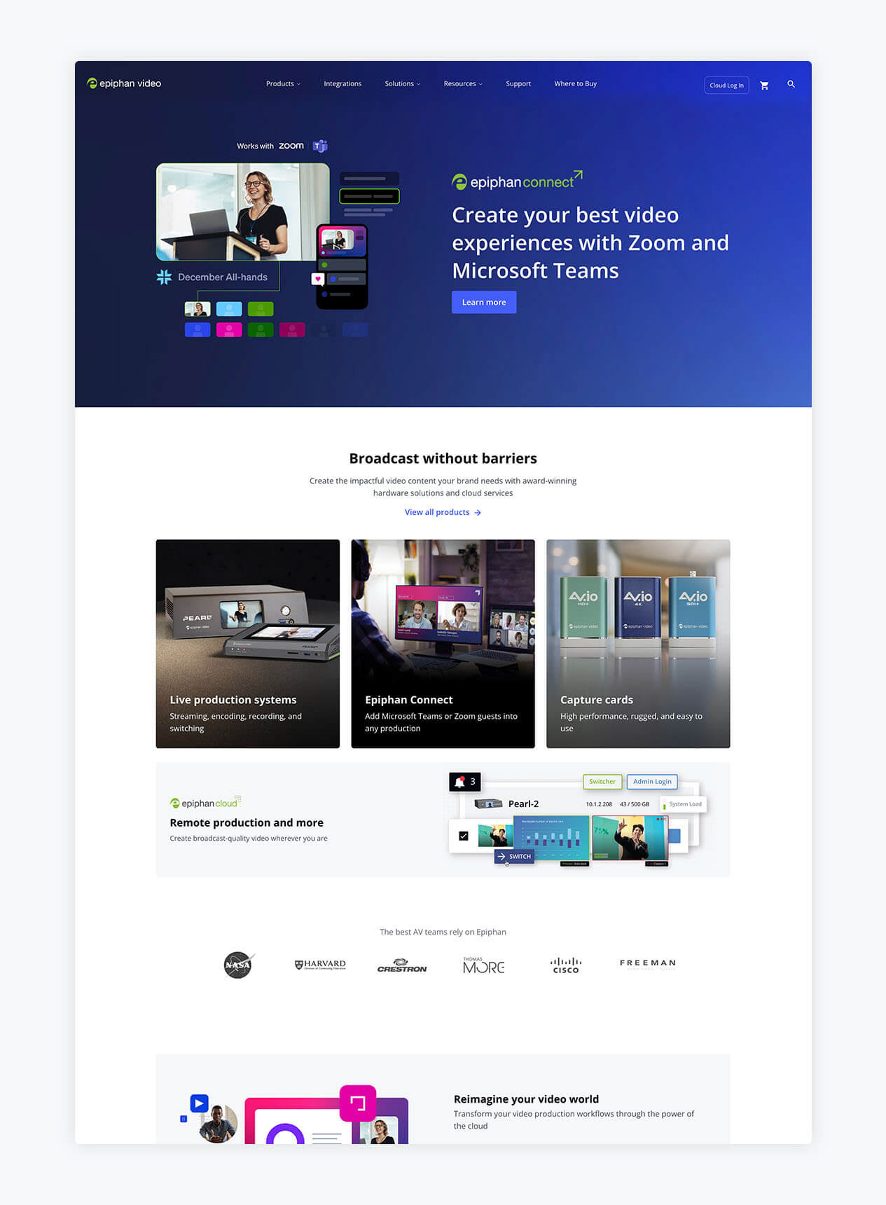
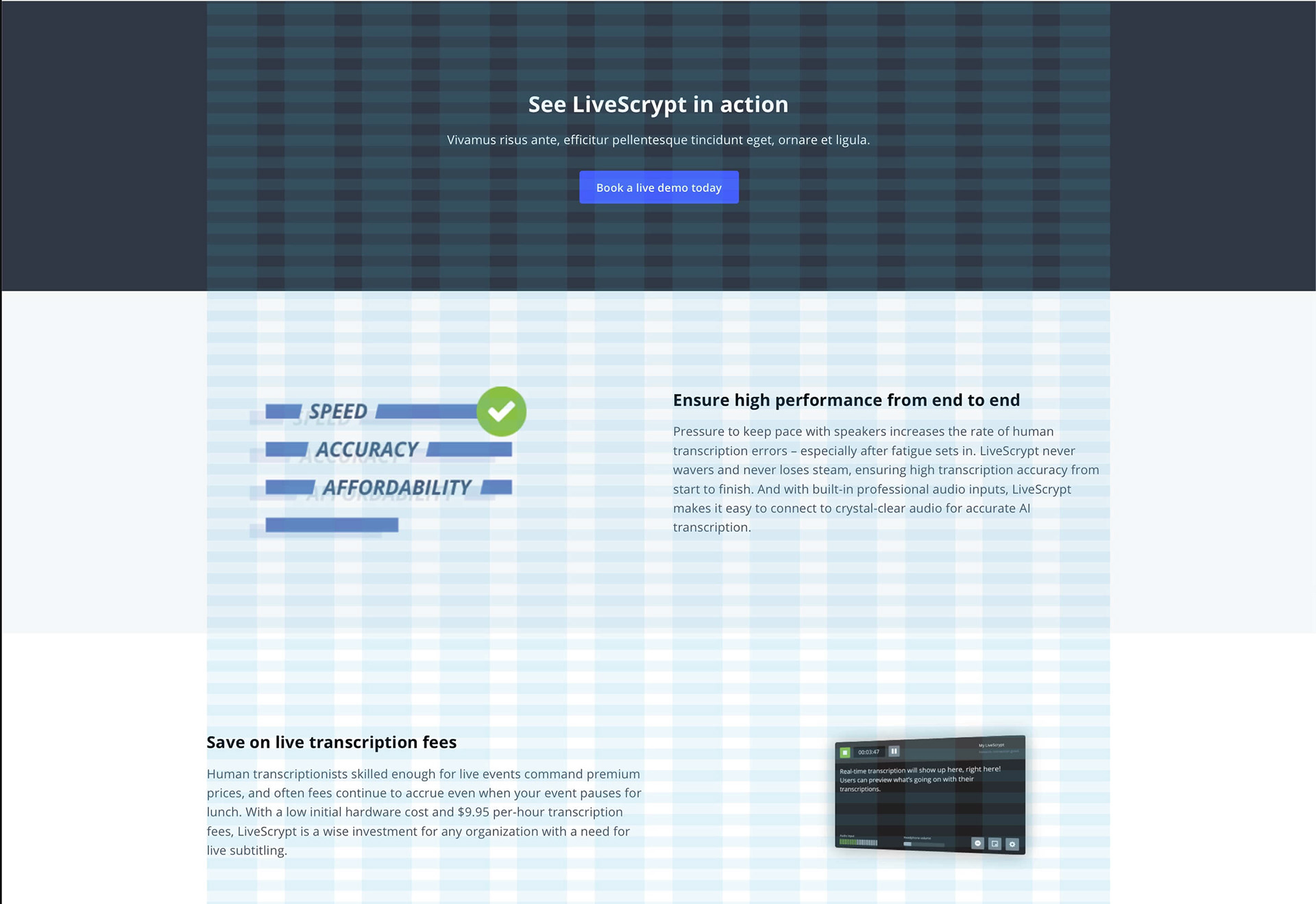
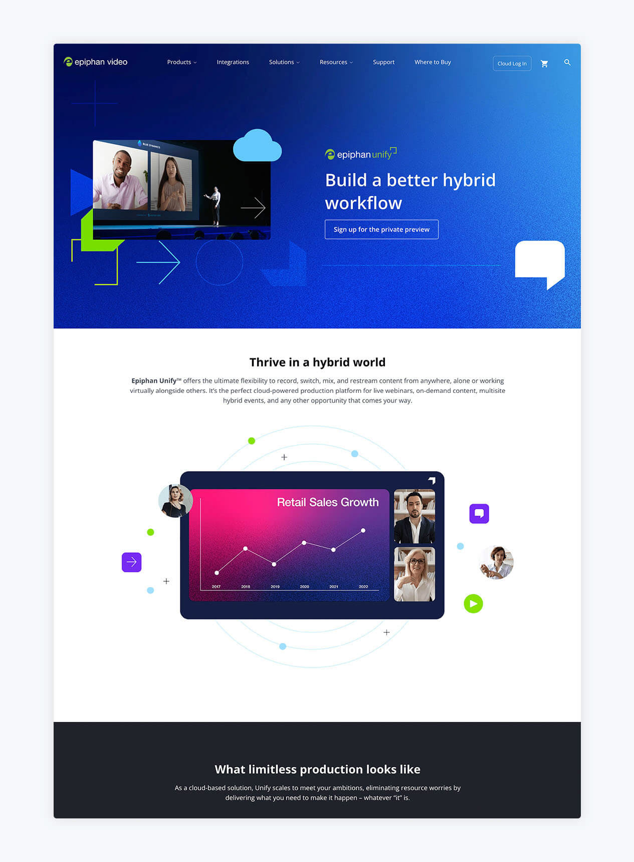
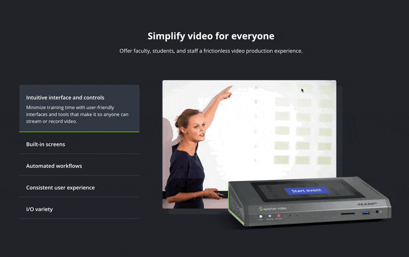
Home page: We wanted to look like a larger company than we actually are, and make it easier for users to understand what our products are and what they do.

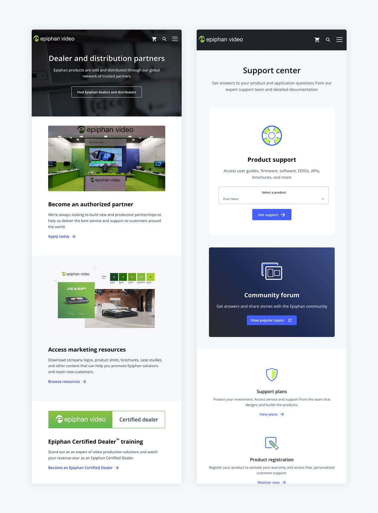
Where to buy page: It had a confusing experience. This page is crucial to the success of the company since most of our products are sold through dealers. Therefore it needed to provide all the necessary links.

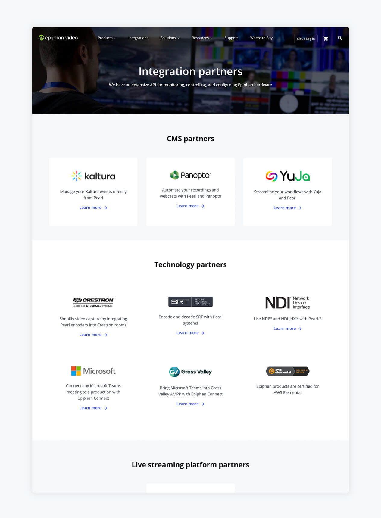
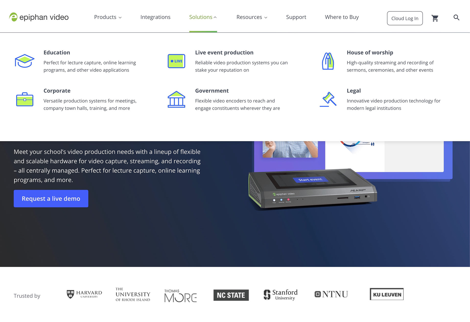
Integrations: Critical in this industry, our integrations were hidden — users had to read our user guide or do a deep search into the product pages. We moved it to the main navigation.

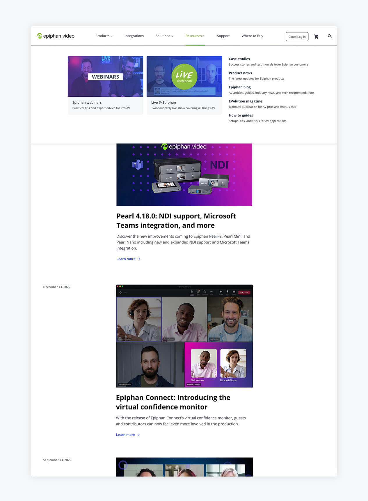
New Resources area: blog, how-tos, webinars, live shows schedule, case studies, magazine, and more. We had plenty of resources scattered across multiple places and it was only natural that we condensed them all into a single area.

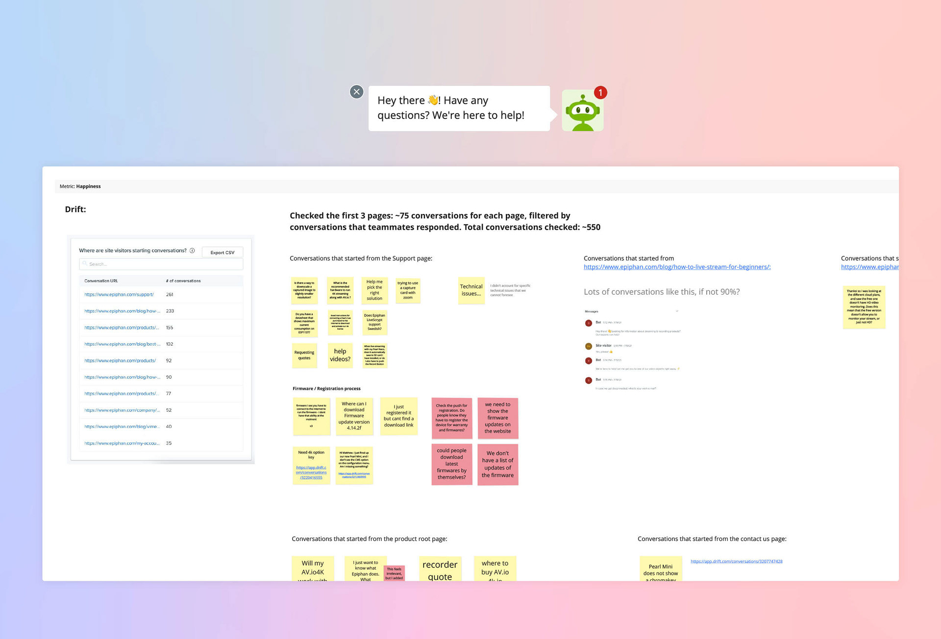
Chatbot: Our chatbot had critical experience issues. By reading the chat logs, I confirmed people were frustrated with it, especially when they wanted a price quote. Efforts were made in tandem with our customer success team to create new rule books and interactions for the bot.

Show and tell frequently to quickly uncover potential issues and make the team part of the process.
We had constant feedback sessions, with me showing Wordpress pages and components to the team on a daily basis. We gathered feedback mostly from developers, content writers, the marketing team, and graphic designers.

During development, we kept testing and made sure the WordPress blocks were working as intended. A staging website was set up to allow our content team to go in and start learning how to create pages and use our components.

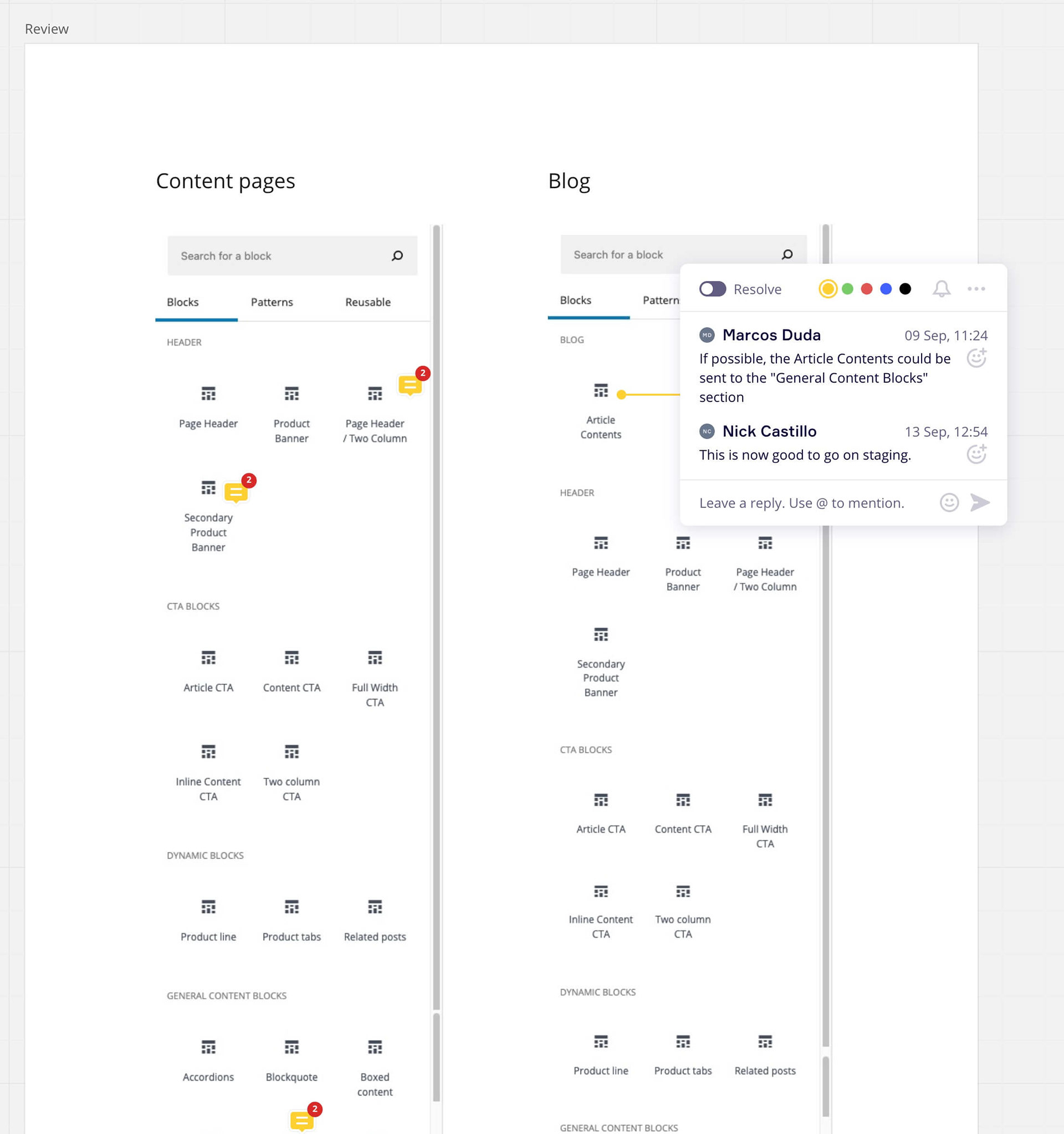
Round of revisions with a screenshot in Miro. The organization of WordPress blocks and their names was important to be defined as well.

Post-launch and iterations:
After launch, the development team kept working on optimizing performance and I slowly started working on extra pages and interactions that weren't critical for version one, but important for the future.
Solutions pages help new customers
We added a completely new section called "Solutions" that had six pages.
The audio-video world is pretty technical and it has a steep learning curve, however, a lot of newcomers need our solutions to stream or record sessions: universities, government, corporations, houses of worship and others.
To facilitate that (and to help with our SEO), we designed pages taking user needs into account for each type of organization. This provides people guidance on their first steps into video production and helps us show them how our products can work in their specific environment, as it puts it in context.

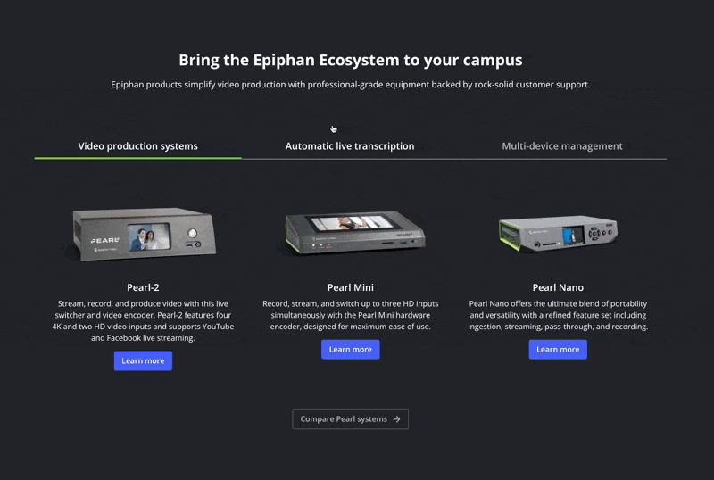
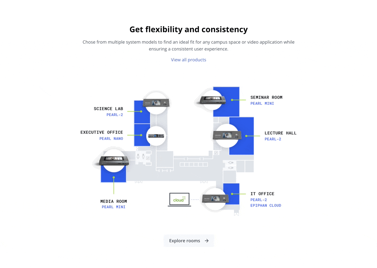
Some solutions pages featured diagrams showing how our products would integrate with a suggested setup. Due to our lack of resources and time, we had to use a carousel instead of making this component truly interactive. On the other hand, these diagrams were reutilized in our print material and live shows.

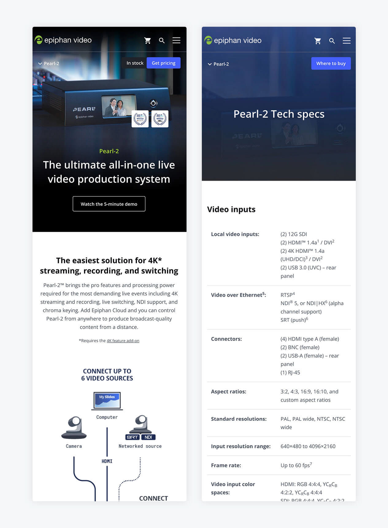
The mobile version needed some new vertical images.

Our clients don't know the names of our products
Something that came up during research is that most clients will call our products "The Epiphan" and not use their real names. With that in mind, we knew that we had to attach product images to the names, so people could rely on the visual only. Hence, a mega menu was designed and we added product photos even in forms.

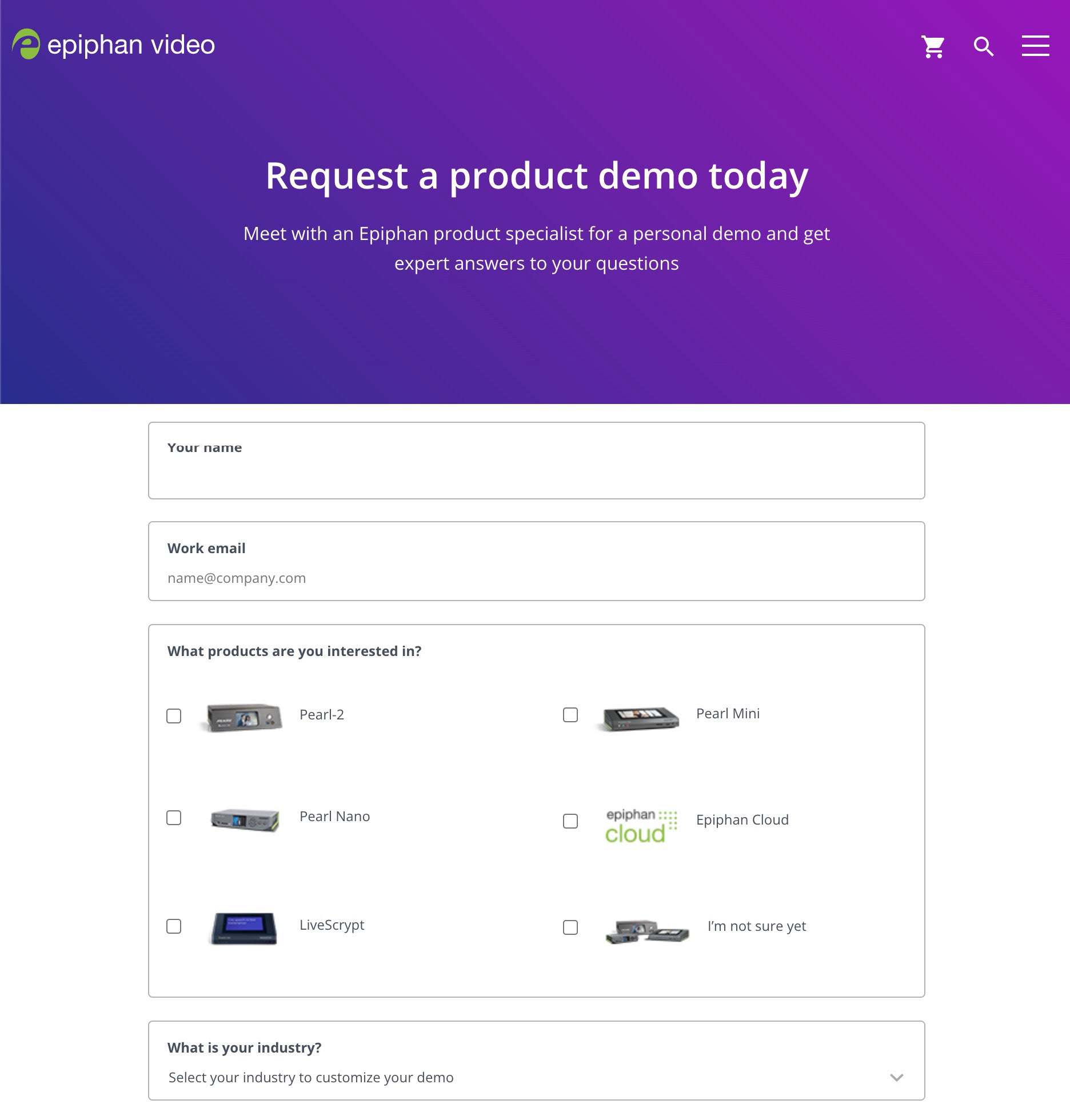
Adding product photos in forms to help with recall.

Product images and quick product descriptions on the menu for desktop and tablet viewports.

We used Hotjar to understand user behaviour.
Our search had bugs, users weren't finding the downloads they needed, case studies were skipped and most people knew what they wanted to see or do on the website.

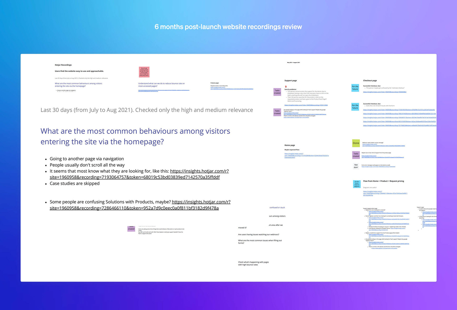
Looking at Hotjar screen recordings we were able to identify issues our users were facing. Some of these issues were fixed, and others were scheduled to be fixed in the future.

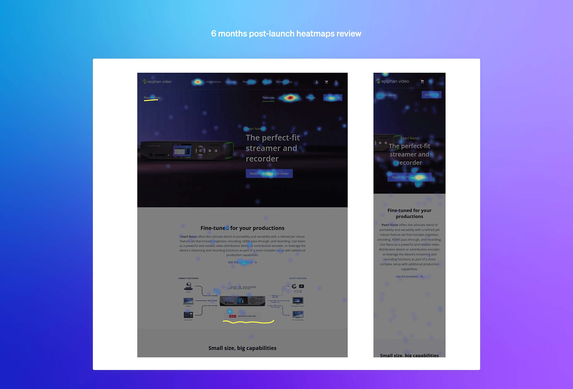
The heatmaps also revealed interesting insights, such as people clicking on our products' diagrams, which wasn't a link. Perhaps there was a need to see them larger on the screen.

Project Results
Internal:
The content team can now create and edit pages by themselves in a few minutes or hours — as opposed to several days — and without the need to involve other teams.
The design system was adapted to create print documents and video assets. The team understood the value of having a concise visual system — teaching the value of a system was an indirect goal of this process.
The whole first release took about 6 months from the first meeting to the launch — the expected timeline.
Website:
Upon launch, we had a 86 score in google speed insights.
Tools for website monitoring for security breaches and outages were added. These actions include SMS messages to our developers in case something critical is out.
He had a good increase in conversions. We had a roughly 2% increase in conversions for our product demo sessions. The average time spent reading our most important case studies is around 1:15min (we didn't have case studies before, so this is a good metric)
Confirmation of assumptions: 
Most users are following our desired flow to purchase a product, however, we were able to identify barriers in conversion (e.g. asking for an email to watch a demo, asking to chat with a representative to find pricing.)
The product diagrams placing our devices into an imagined workflow are very useful. Our heat maps confirmed this assumption.
Through User Recordings from Hotjar, we identified that some people are not finding the support they need, especially firmware.
Learnings:
Exercise in constraint: doing only enough to move forward and iterating often.
I believe designers love to redesign artifacts from scratch, however, the challenge here was to understand the audience, business goals, resources available, and only redesign what was needed.
A new website and design system go beyond the visual realm.
I had to look at the brand as a whole and search our content on Youtube, forums, Twitter, besides talking to several coworkers to uncover potential issues and missing content from the website.
UX is in every touch point
I spent a huge chunk of my time looking at forms, email confirmations, documents, language, chatbot interactions, etc, which are of great importance to our buyer's personas. My task was to teach and show the team that a good user experience is much more than making something look good, users need to meet their goals with ease and fluidity.

____________________


Credits:
Admin: Misha Jiline, Mike Sandler.
Marketing Management: George Birchall.
Design: Marcos Duda, Lisa Johnson.
Front-end: Nick Castillo.
Marketing team: Dan Wallace, Marta Chernova, Victor Doubrovine, Michael Monette.
Customer Success: George Herbert, Mathieu Renaud, Zack Bell, Adam Palmer, Ryan Haynes.
+ The whole team at Epiphan Video
Back to Top