Fixing a baby store’s unfriendly online experience
With four locations in Metro Vancouver, Canada, Crocodile Baby is a store specialized in healthy, organic and long-lasting products for babies such as strollers, furniture, essentials and more.
Date
Aug-Dec 2019
Aug-Dec 2019
My Role
Research | UX Design | UI Design
Research | UX Design | UI Design
Responsibilities
Research, strategy, wireframing, presentations, UI Design.
Research, strategy, wireframing, presentations, UI Design.
Problem and context
A baby store with an unfriendly online experience.
Crocodile Baby’s website needed an overhaul to better assist all types of visitors. It looked uninteresting, outdated, hard to use, and it didn’t accurately reflect the brand voice of the company. On top of that, the staff always had issues and spent too much time updating the content, products and product variations due to a lack of synchronization with their POS system.
Goals:
• Redesign the website to generate more conversions and improve their online brand equity.
• Implement a better way to upload, view and buy products online syncing it with the POS system and the website.
How might we save staff’s time by improving the e-commerce structure and syncing it with the POS system while also redesigning the website to make the brand look more approachable?
The Approach
1.
Discovery and definition:
A new POS system and an overwhelming checkout process.
A new POS system and an overwhelming checkout process.
The Challenge
Currently, the store was using Magento CMS which didn’t fit their necessities as it was set up with different needs in mind.
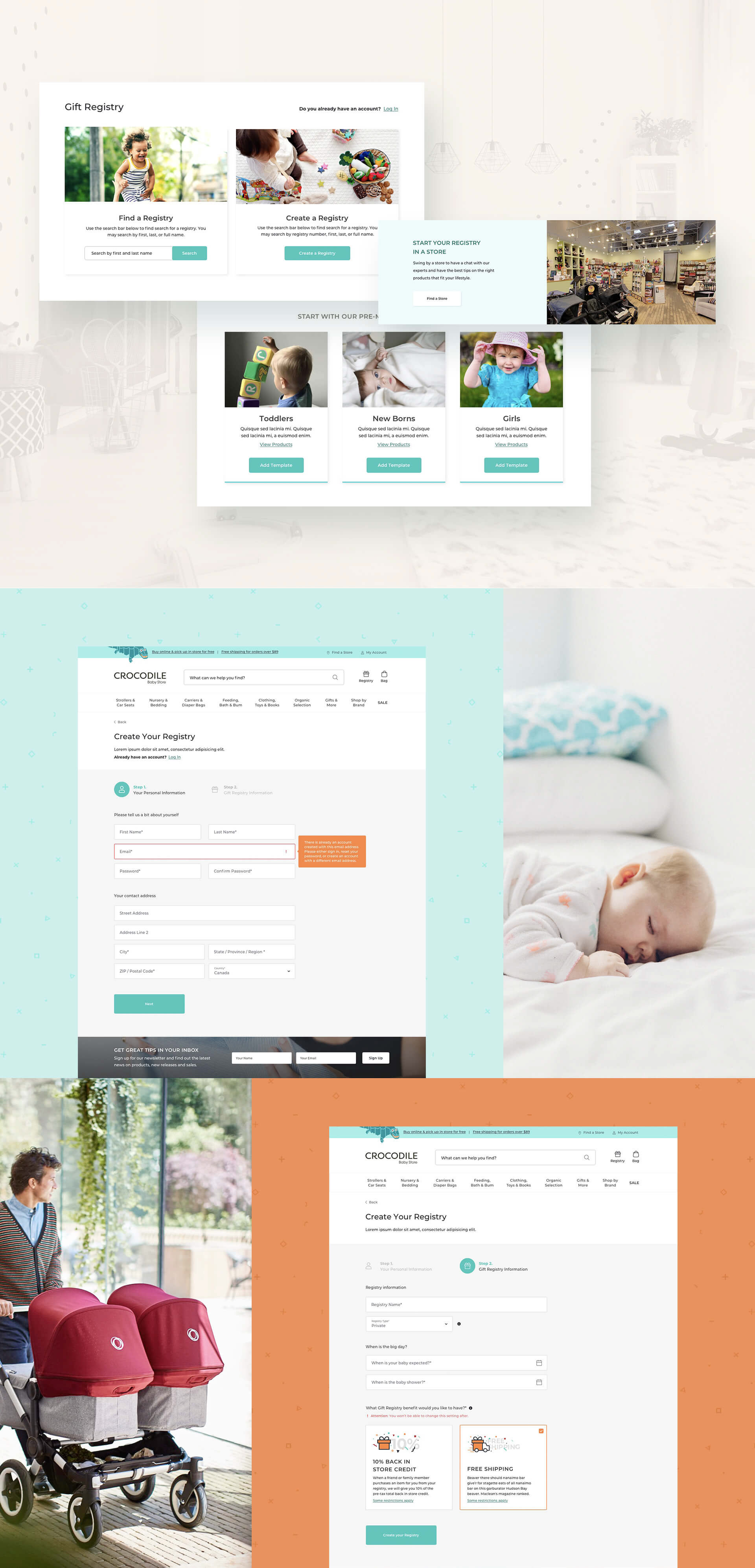
For end-users, the website had poor usability and some of its pages weren’t working as expected. The checkout process was overwhelming. Return and Exchange information wasn’t easily accessible, bringing the store’s rate down. The navigation was poor and the Gift Registry was also quite difficult to use and it didn't have its rules clearly communicated.
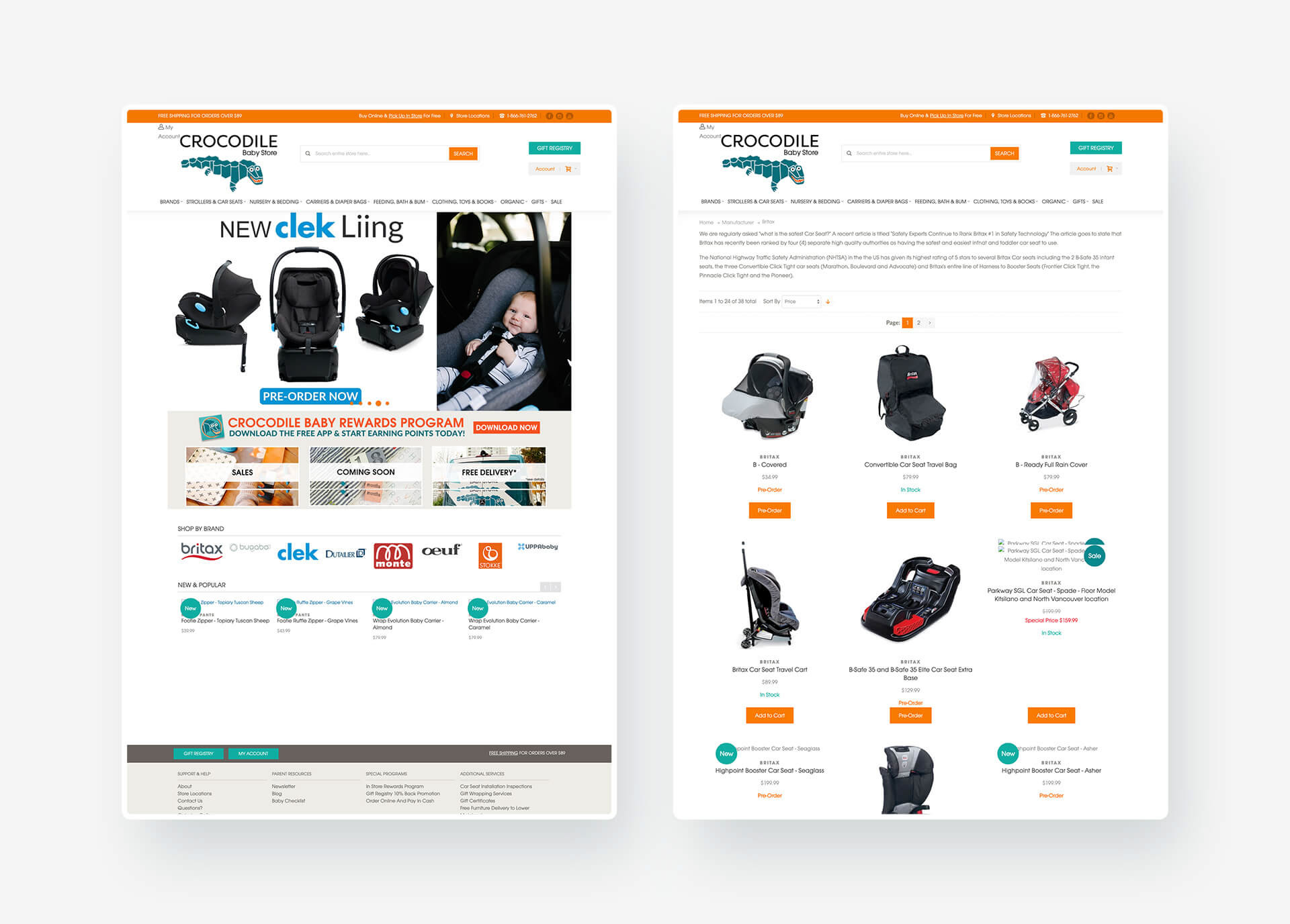
Former Crocodile Baby web store.
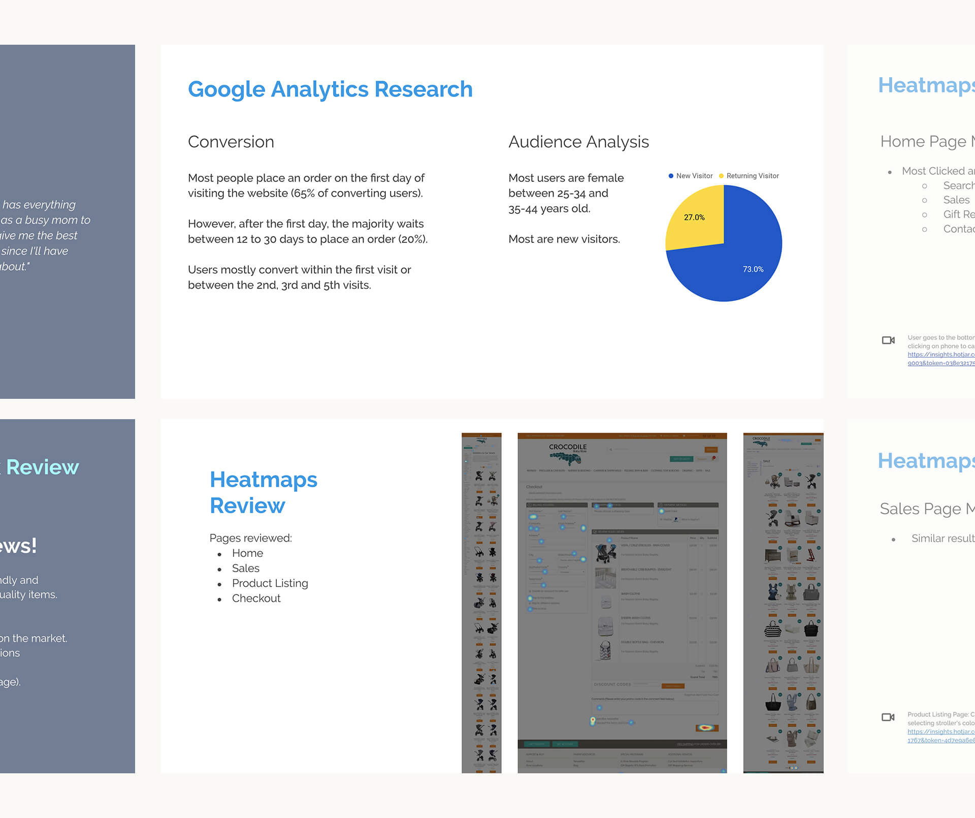
Discovery research. Analyzing Google Analytics, heatmaps, and recordings with Hotjar.
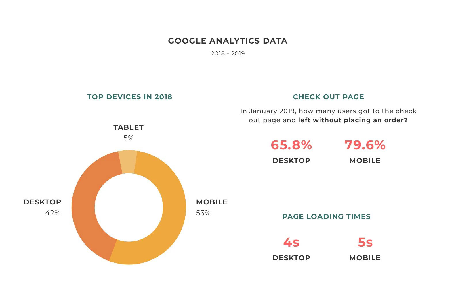
More than half of the users would leave the checkout page without placing an order.
The checkout page was one long form that lacked a good hierarchy. Google Analytics revealed that the number of people leaving the page without finishing an order was astonishing. That was even worse on mobile devices, which accounted for 58% of the website’s visits.
We had assumptions on why this was happening and we also used Hotjar to record users to see from their perspective. The recordings were useful to convince the client that the checkout needed a redesign.
People were confused by the return and exchange policy.
Crocodile Baby had various rules about specific products and these rules weren't clearly communicated on the website. This lack of information led to friction and mistrust among consumers.

User reviews of physical and online stores.
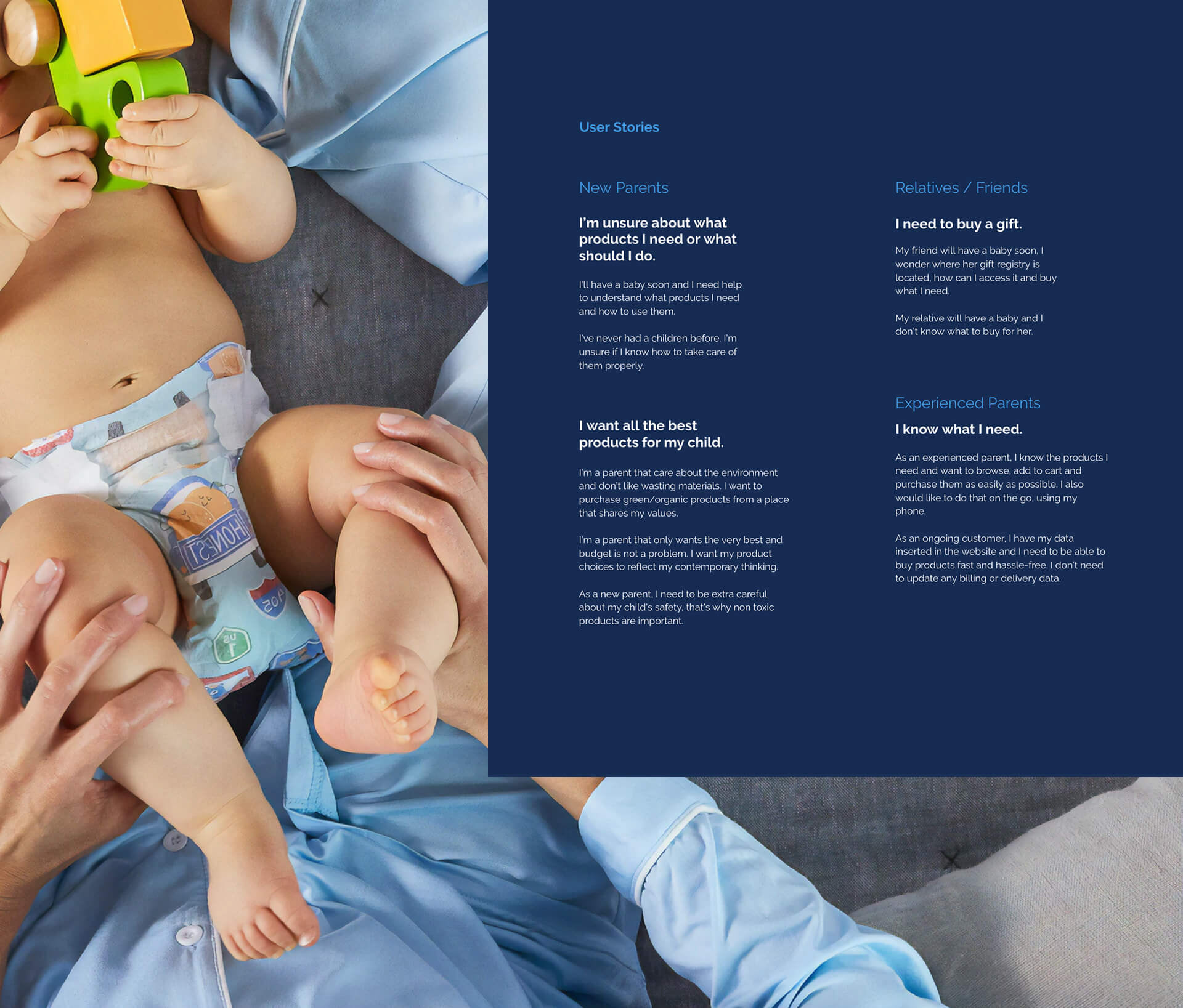
Assist two types of users: novice parents and experienced parents
Novice parents need to think of Crocodile Baby as a reliable friend. They are overwhelmed by the amount of knowledge and support they will need as first-time parents. Tools like product lists based on style or necessities, educative blog articles, product filtering, and personal in-store assistance are important to make them feel cared for.
Experienced parents just want to quickly find what they are looking for. They know the products and are more interested in the search, filtering and how easy it is to purchase.
Unfortunately, the client wasn’t comfortable with user interviews, so we relied on web reviews, stakeholder interviews and social media to dive deeper into some users’ thoughts and desires.
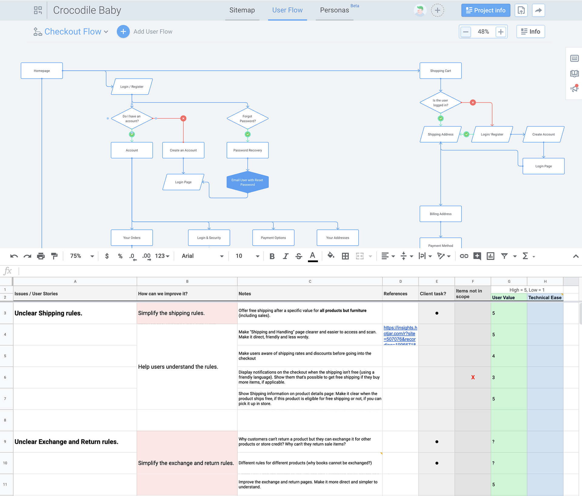
Work in progress. Above: User flow for the login and checkout. Below: features prioritization list.
The advanced search was a must and the navigation needed a lift.
Perhaps the best feature of the past website was the search. It was advanced enough to suggest products while you were typing and it would search by brand, type, name and SKU, which was essential for the Crocodile Baby staff.
However, the navigation wasn’t so smooth. Apart from having unforgiving three-level dropdown menus, some products weren’t organized as expected.
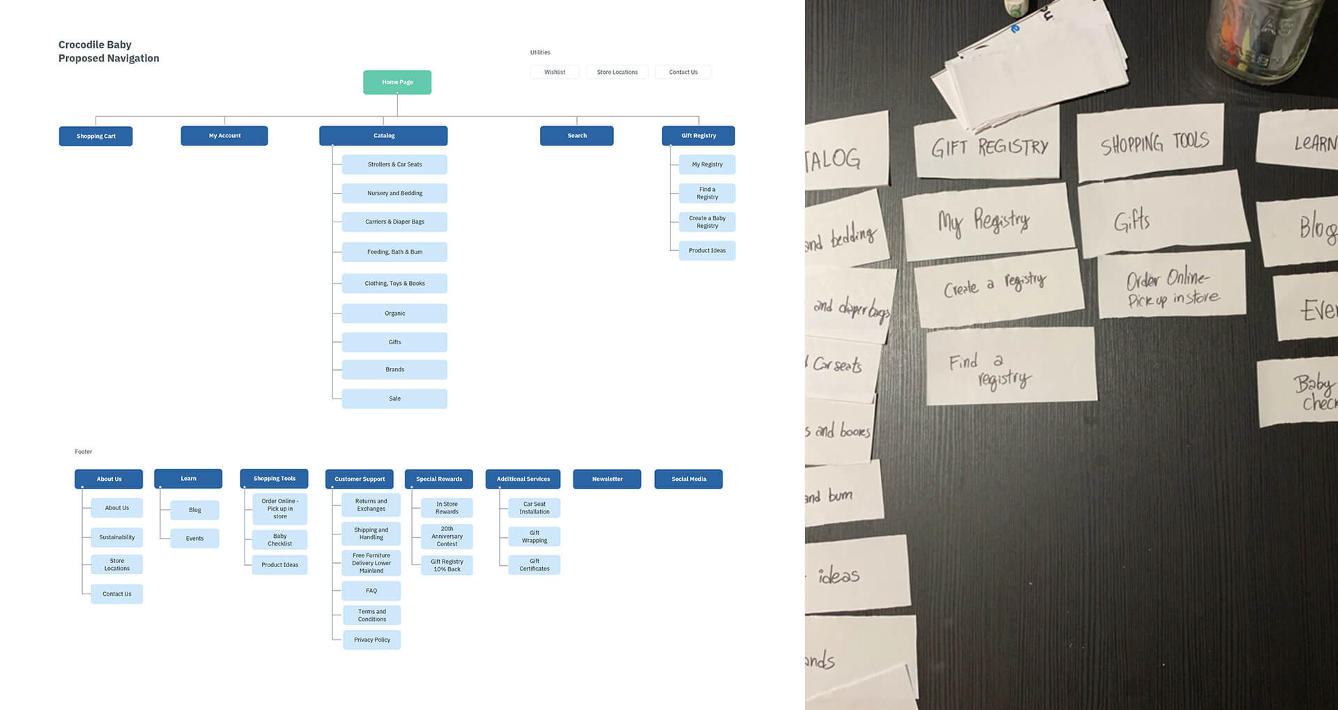
Final navigation and a card sorting exercise made with colleagues.
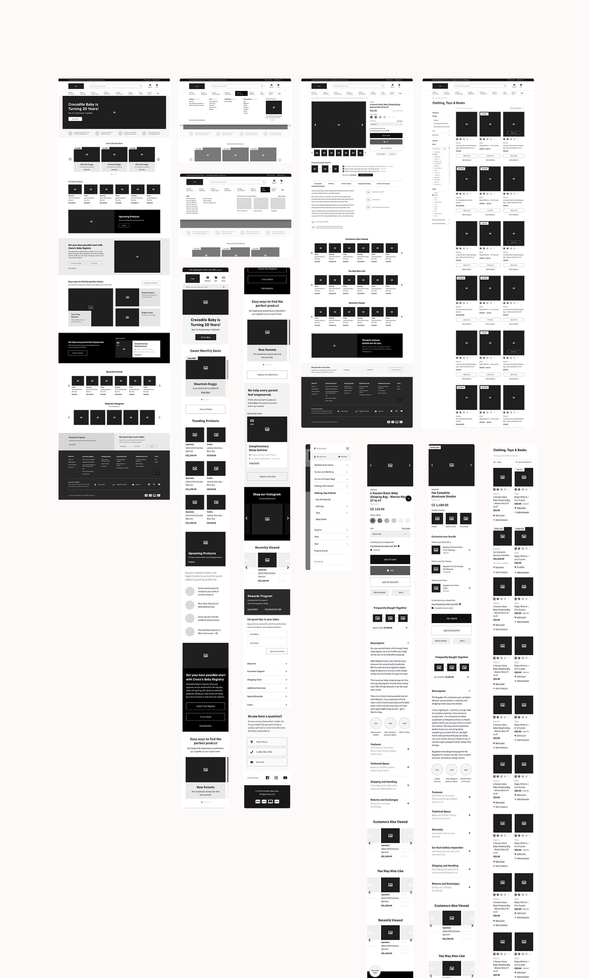
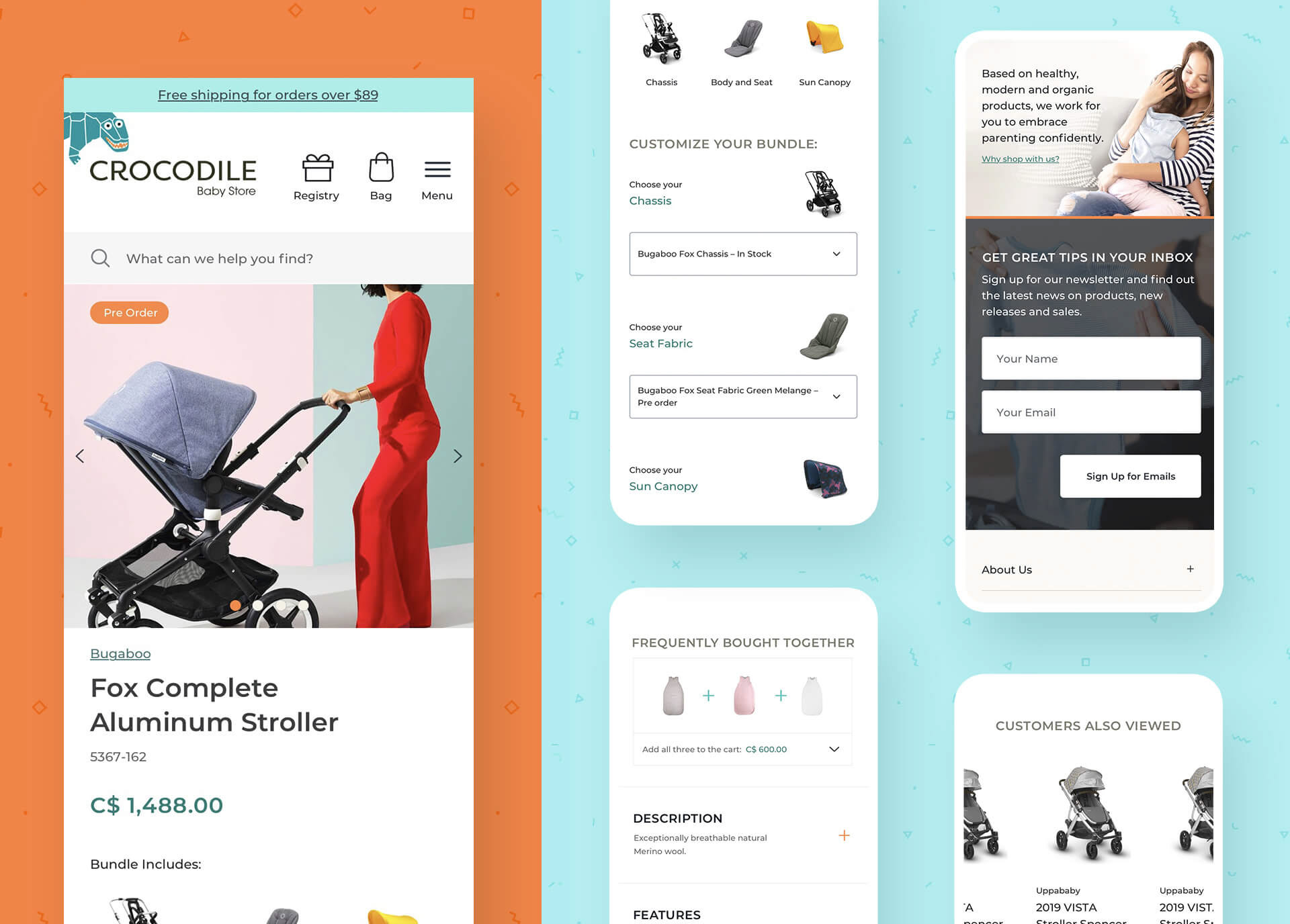
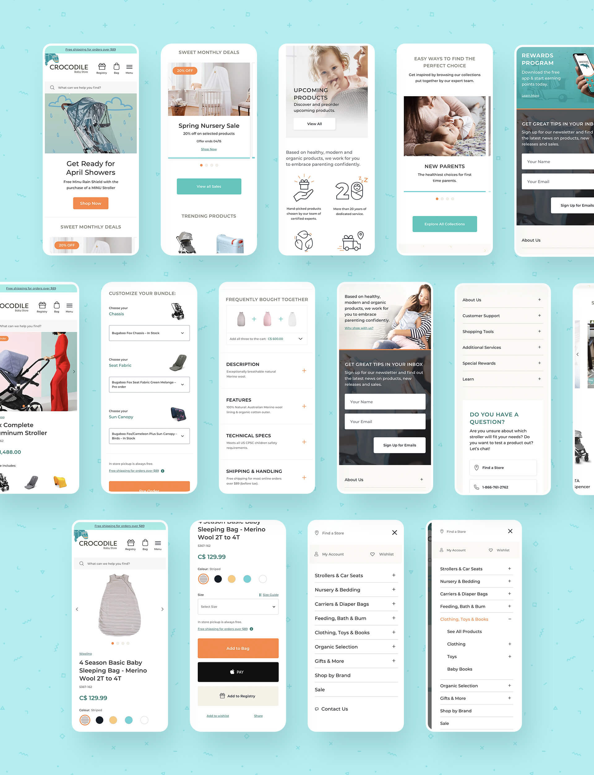
Wireframes: mobile first that developed to desktop. After these were approved, the programmers started working on tasks that didn't need visual design.
2.
Visual design:
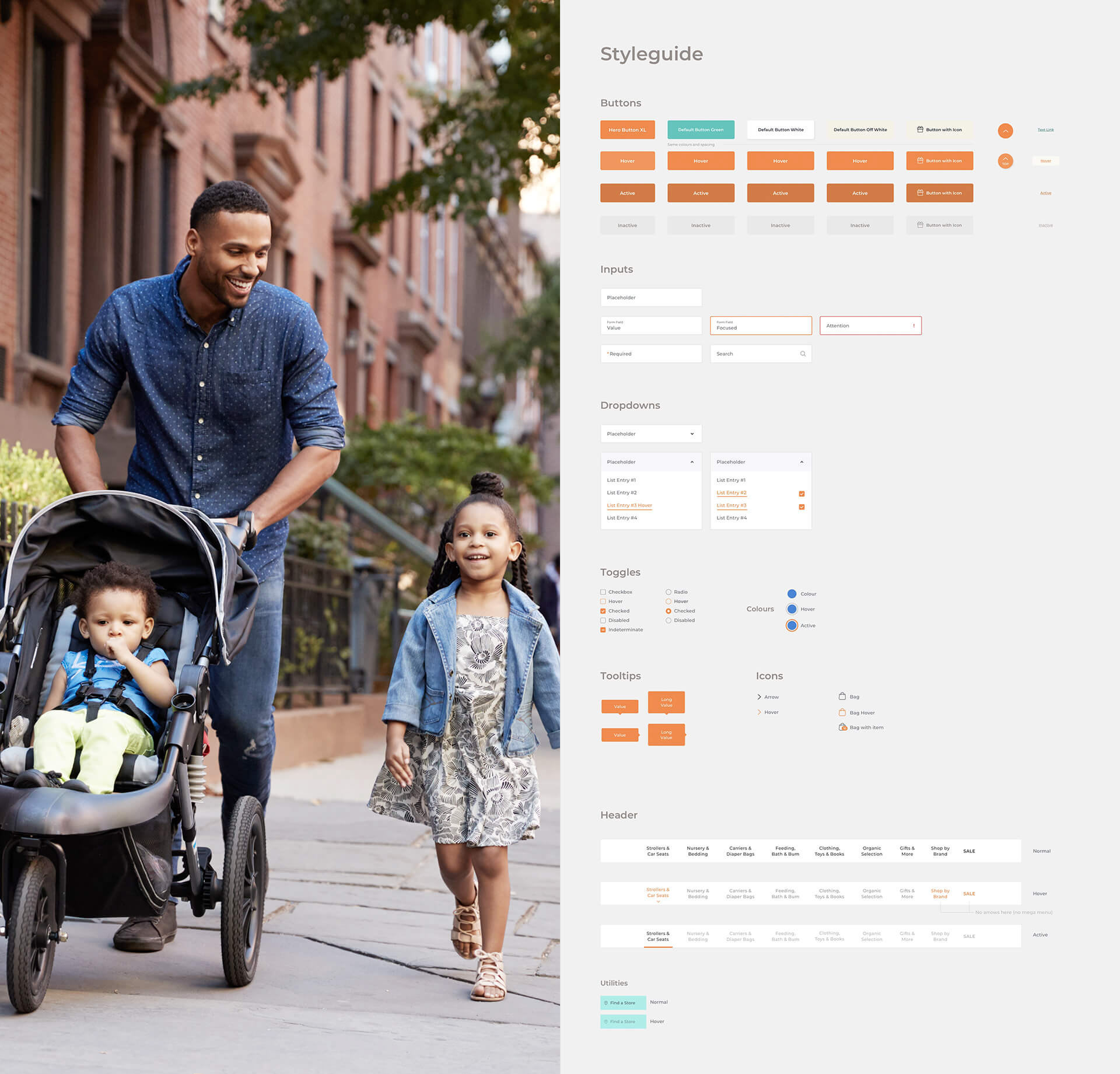
Simple, bright, calm, minimalistic and caring.
Simple, bright, calm, minimalistic and caring.
We defined most of our visual references at the kickoff meeting.
Crocodile Baby had a clear idea of what they should look like and we all agreed on the main references from the get-go.
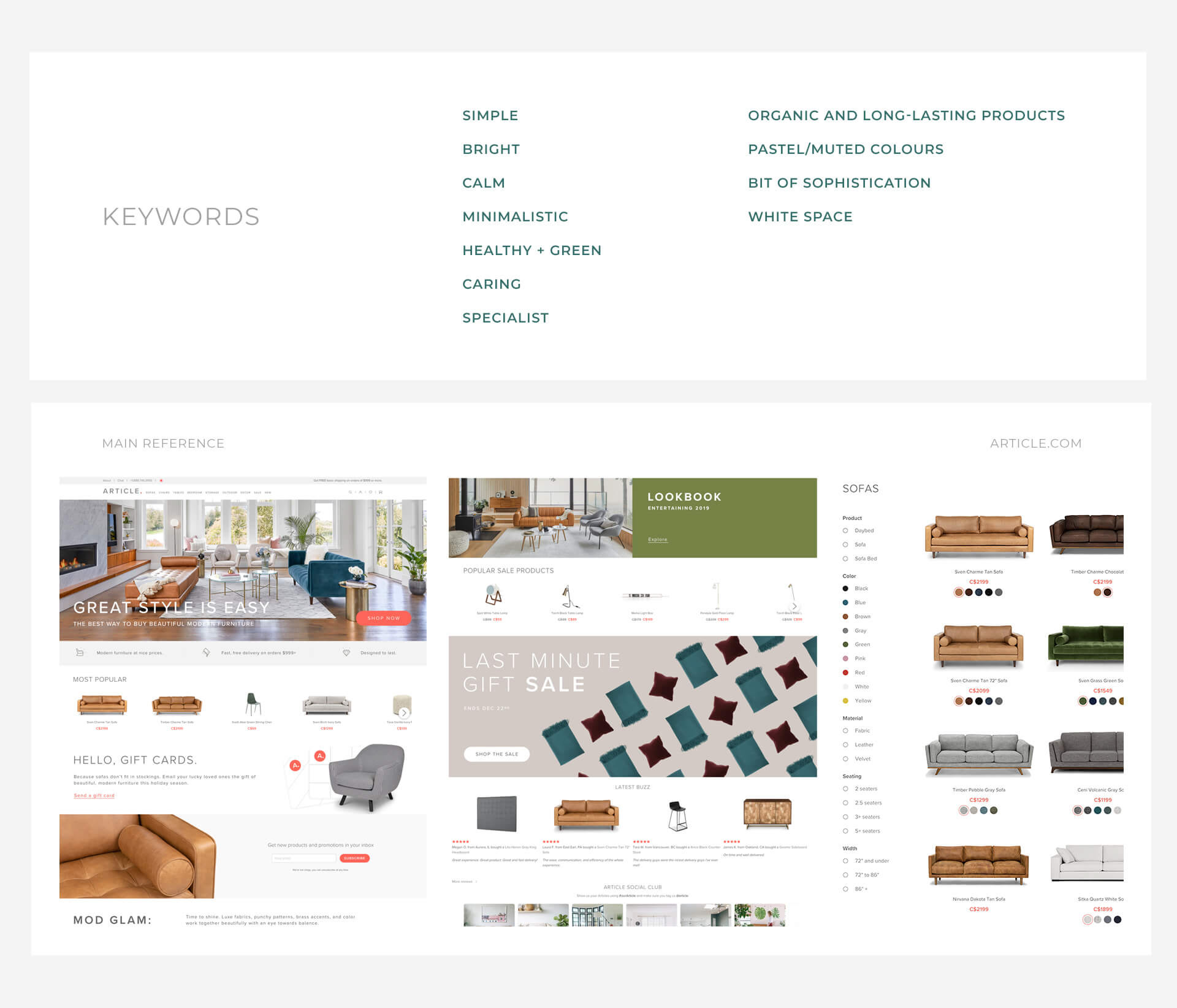
Visual keywords and main look and feel reference.
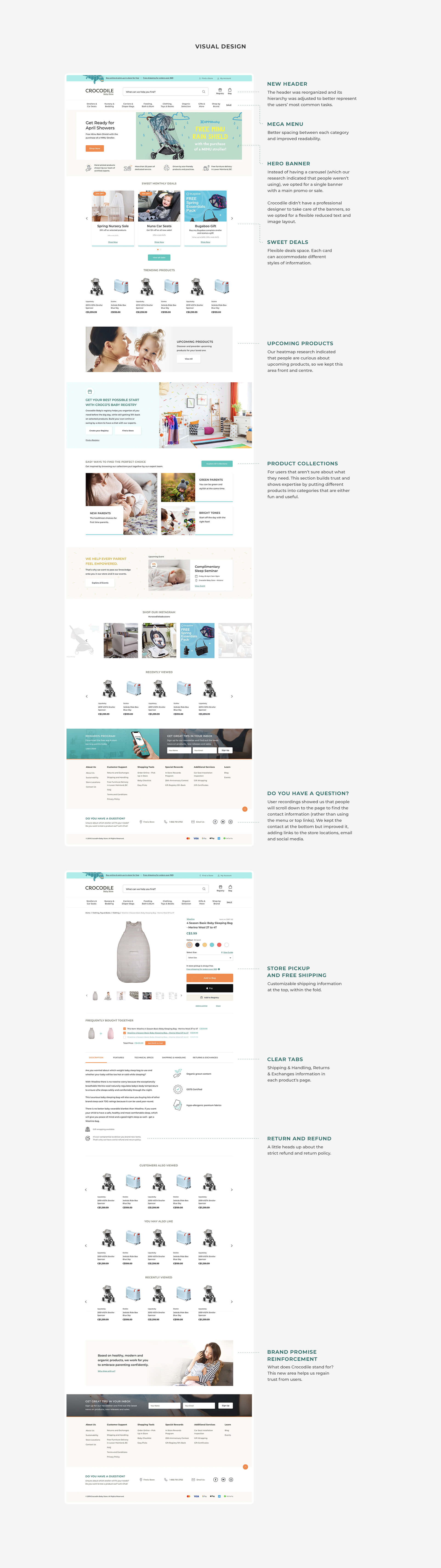
Does it ship for free? Can I return it? Know before you buy.
The past design didn’t clearly show some product rules. Crocodile treated different products with different shipping and return rules, so we had to let the audience know the restrictions before and during the purchase.
The checkout process required a lot of cognitive load.
The checkout page was a single page with two-column forms. It demanded a lot of thinking from the users. The client wanted to keep it that way, as they liked to see all the forms on one page but, after our discovery, they changed their mind and agreed on a multi-step flow.

3.
Results and learning
1. Be ready for change and don’t be precious about an idea.
Due to several unforeseen issues, including the POS and some changes in scope mid-project affecting the product data switch, the website had to be delayed for 2 months. In the end, we couldn’t launch it because Crocodile was sold to another baby store.
2. Prioritize experience over features.
Project restraints made us focus solely on improving usability and flows to make the website easier to use.
We had a lot of ideas for new features based on end-user requirements. However, since we were pressed for time, we focused only on the basics.
3. Have a basic content strategy and tools to help the content creators.
We needed to be ready for non-optimal content entry. We relied too much on the client to provide copy and, in the end, it didn’t match the new navigation. Apps such as Gather Content came in handy — it gives a clear structure for content creators to follow.
4. Collaboration is key.
The product data had to be fixed by ourselves, which caused a strain on the team as we hadn’t planned for this. In the end, after some collaborative effort, all was ready to go.
5. Research reports and artifacts can save hours of discussion
The stakeholders weren't too keen on some of our recommendations and we quickly realized they wouldn't accept them unless we showed actual research data. By showing recordings and heatmaps, we were able to quickly change their minds without extra discussion.
6. Visual design is just the tip of the iceberg.
I’ve designed e-commerces before, but this was the first time I was deeply involved with the development team and was aware of most technical problems. I wore many hats, as I created UX copy, was part of technical decisions and input and reviewed batches of new products attending to our new structure. I confirmed the substantial importance the proper definition of User Flows has in e-commerce — there are so many variables! — and what looks simple on the surface (e.g. a login page or shopping cart) can be hard to get right if you don’t plan.
___
Credits:
UX/UI Design: Marcos Duda.
Web Development: Alonso Ysa.
Project Management: Rory Mullin.
Admin: Evan Holmgren.
Web Development: Alonso Ysa.
Project Management: Rory Mullin.
Admin: Evan Holmgren.
Developed at CodeHammerhead.
____________________
More projects
Options Solutions
UX/UI Design and Brand Redesign for Options Solutions.
Brand and website redesign enabling 8% monthly conversions after launch.
__
UX Research • Branding • UX Design • UI Design • Design Lead
Epiphan Cloud
Remotely control and customize hardware devices from Epiphan Video.
Easy creation, configuration, and video content streaming. All done remotely by leveraging Epiphan's hardware devices.
__
Product Design • UX Research • Design Lead
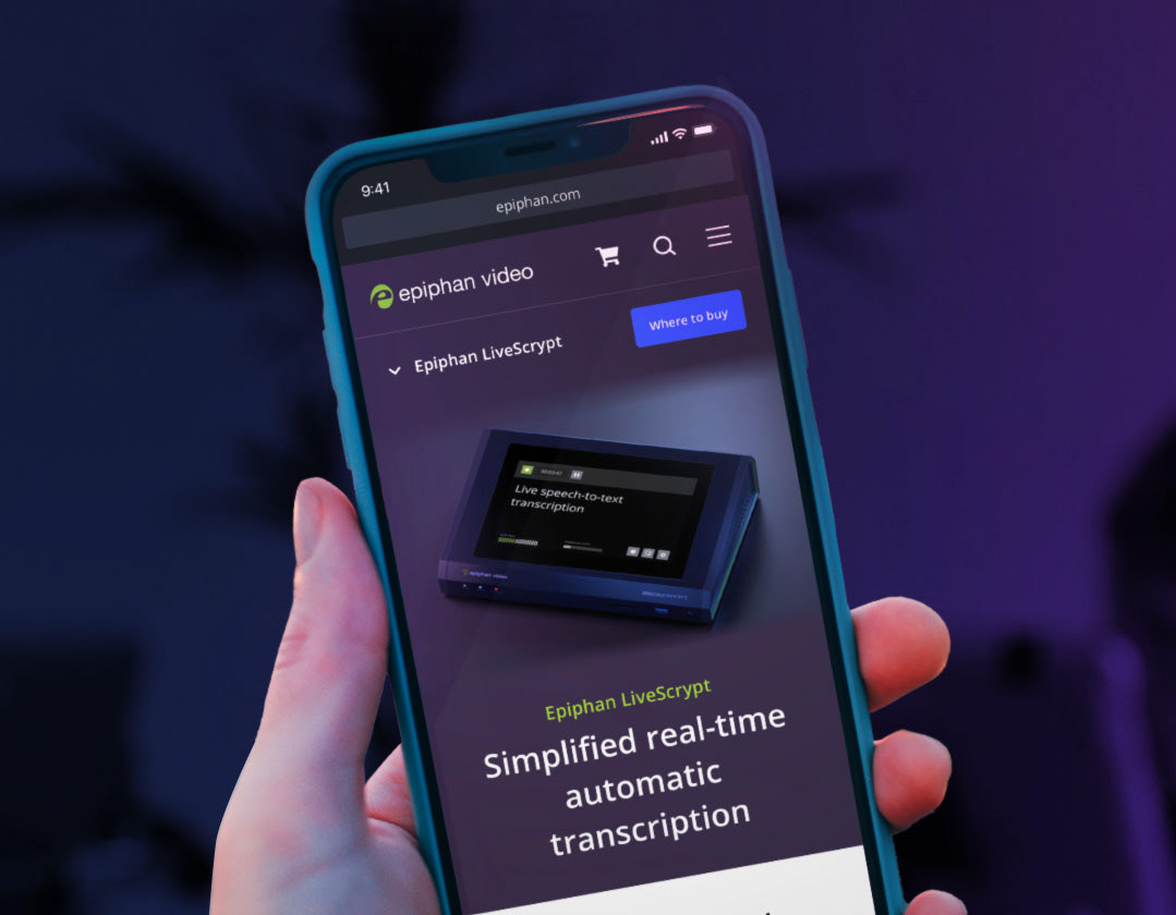
Epiphan
Creating a system to speed up website updates.
A 2% increase in conversions after a redesign. Website content updates are done 90% faster.
__
Branding • UX Design • UI Design